
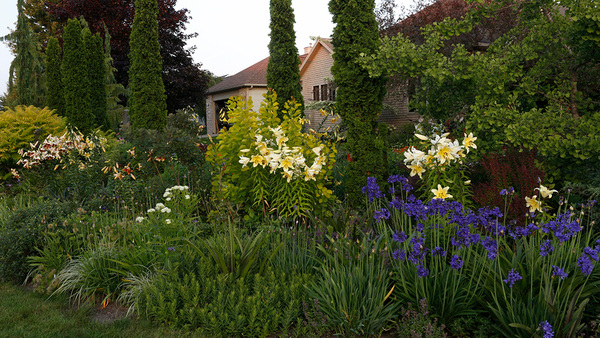
As an amateur artist, I know that four is the number of hues I can use in a painting without it starting to look garish. The more colors you use on the canvas, the more chaotic a scene can get. This outlook on color came in handy when my husband and I moved to a property within the city limits of Eureka, California, several years ago. I was overwhelmed, at first, by the prospect of having to make all new plant selections and of figuring out where and what kind of hardscaping to install; in addition, all of this needed to be done in harmony with the surroundings. To make things easier, I decided to look at the potential landscape as a blank canvas, applying the lessons I learned about color in the studio to guide my choices in the garden.
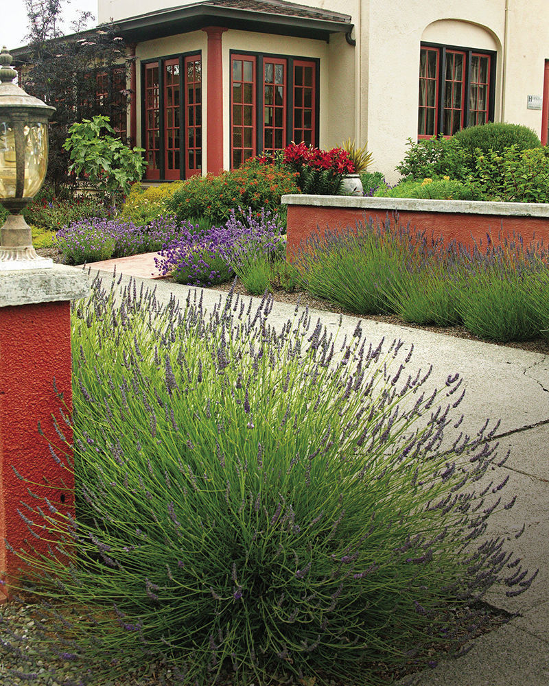
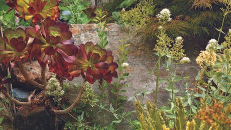
The hardscaping had to come first for logistical reasons. I picked a classic terra-cotta color for the outbuildings and knee walls because it matched the trim of the new house. I then found four colors that looked good with terra-cotta. Two of the colors were similar to or harmonious with the terra-cotta hue, while the other two were balanced opposites and somewhat complementary. My plant choice and plant placement thereafter was entirely based on color. The result was a minimalistic, well-organized garden that was still stunning.
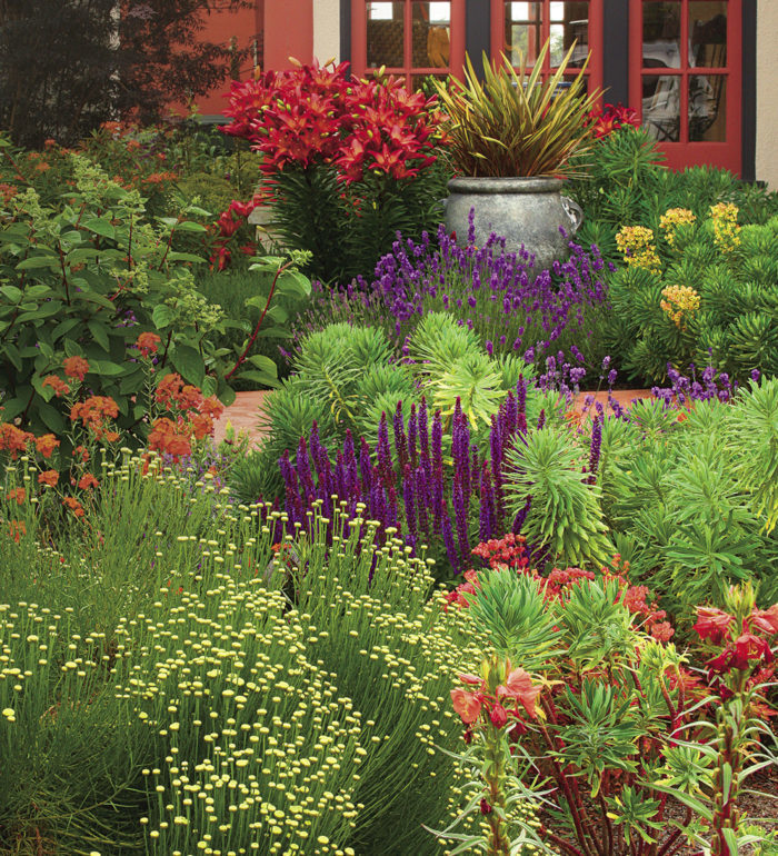
Pick two colors that are harmonious and two that are complementary
After the hardscaping went in, I had a starting point for the rest of the garden planning. I drove to the hardware store armed with a small sample of the terra-cotta color and went straight to the paint department. I kept pulling out paint chips until I found two colors that were in perfect analogous harmony with the terra-cotta. Those colors were a dark red and a yellowish orange. I then focused on finding two colors that offset the red and the orange, and those colors were chartreuse and purple. These four colors were now the basis of how I would select any plants destined for my garden.
Using colors similar to the hardscaping ensured that the garden would always be tied to the house and its surroundings. And employing the two opposite colors ensured that the garden would always stand out and be eye-catching. There was some wiggle room with the plant colors: They didn’t have to match the paint chips exactly, but they needed to be an obvious shade of the inspirational color. By sticking to the four-color scheme, I was able to narrow down my plant choices, which made the daunting task of plant selection easier. On every trip to the nursery, I was armed with my paint chips, which helped keep me on point with my purchases. But I remained mindful of a plant’s preferred conditions, never forcing a shade plant, for example, to try to survive in my full-sun garden.
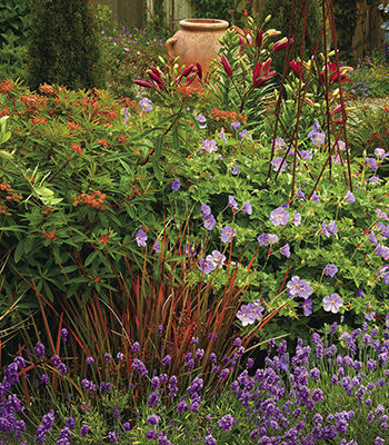
Although this approach might seem too limiting for some, I actually found that it opened me up to unexpected options. I would never have thought, for instance, that Asiatic lilies (Lilium spp. and cvs., USDA Hardiness Zones 3–8) would have any place in a Mediterranean-style garden. But because the variety ‘Sweet Lord’ has dark red blooms, I planted some and, afterward, noticed that their rigid shape looks similar to that of some of my euphorbias (Euphorbia spp. and cvs., Zones 4–11). If you’re not starting from scratch, you can edit and simplify a chaotic garden by removing the plants that don’t fall into your four-color scheme.
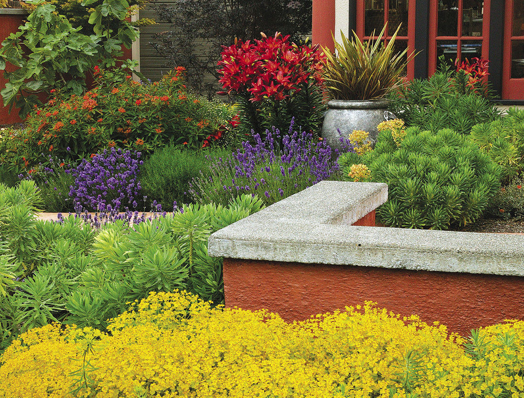
Place each group of plants next to a group of complementary neighbors
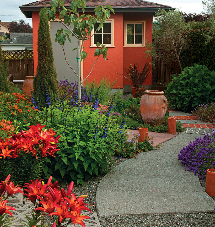
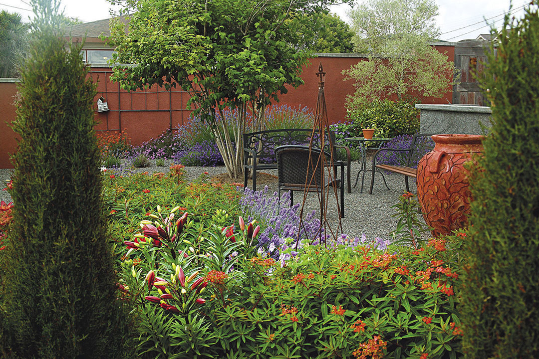
With my plants chosen, I next devised a plan on where to put them all. I started with the large shrubs and placed them in the middle of the beds because the garden can be seen from all sides and I didn’t want them blocking the view. Working out from the shrubs, I then planted groupings of plants whose colors were complementary; if the shrub were ‘Winter Red’ leucadendron, for example, I would put something purple or chartreuse around it. Next to those complementary groupings, I placed more groups of plants that had a different complementary color. Throughout this color-blocking planting plan, I tried never to place a group of purple lavender, for instance, next to a group of purple salvia (Salvia spp. and cvs., Zones 5–11) or even lime green santolina (Santolina spp. and cvs., Zones 6–11) because it wouldn’t have provided the right visual impact. The lavender looks better when paired with something yellow-orange or red. I kept alternating the groups of colors until the beds were filled. If I ever became stuck or confused about what plants needed to go where, it helped to go up onto our second-story balcony to get a bird’s-eye view.
There came a point, inevitably, when there was not enough room to squeeze in a group of complementary-colored plants, so I, instead, left the space empty. You might think that these holes would be perceived as eyesores, but they actually help calm things down a bit. The blank spaces allow the eyes to rest, which is needed in a garden filled with so much riotous color. Additionally, the bare spots break up the masses of plants and allow the plants surrounding the holes to stand out more and truly shine. And as a bonus, the empty areas are the perfect place to put your feet when weeding or pruning.
When I tell people about the evolution of my garden, they often tell me that they would never have the restraint to stay so limited in their plant selection and placement. My response is that, by staying disciplined, I ended up with a garden that is exciting, blends in with its surroundings, and is easy to care for—just what every gardener strives for.
Sticking to four colors isn’t that difficult
I’ve picked several plants over the years that have been the right color but that have died because they were finicky. Some selections, however, have proven to be amazing. With plants like the following, sticking to just four colors is easy.
Red
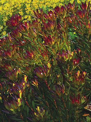
Name: ‘Winter Red’ leucadendron (Leucadendron salignum ‘Winter Red’)
Zones: 9 to 11
Size: 3 to 5 feet tall and wide
Conditions: Full sun; well-drained soil
If there is one plant that seems to draw attention all year long, it’s this beauty. The red leaves of ‘Winter Red’ leucadendron turn a brilliant scarlet in winter, when much of the garden is sleeping. For the rest of the year, its colorful foliage is still beautiful, adding a nice backdrop for anything chartreuse that is planted nearby.
Orange
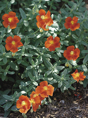
Name: ‘Henfield Brilliant’ rock rose (Helianthemum ‘Henfield Brilliant’)
Zones: 6 to 8
Size: 1 foot tall and 18 inches wide
Conditions: Full sun; well-drained soil
The long-lasting, coppery orange flowers on this low-mounding, wide-spreading plant are spectacular. ‘Henfield Brilliant’ rock rose is one of the most drought-tolerant plants out there, and in much of the country, it is considered an evergreen subshrub. It also fills in quickly, without being thuggish.
Chartreuse
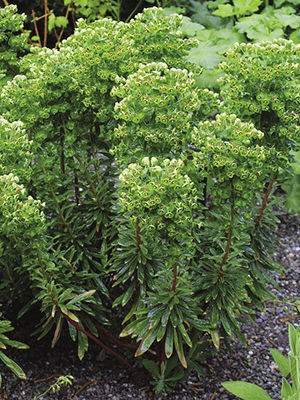
Name: Red euphorbia (Euphorbia × martinii)
Zones: 7 to 10
Size: 3 feet tall and wide
Conditions: Full sun to partial shade; well-drained soil
You can expect wonderful, structural foliage year-round from this sturdy perennial, and its chartreuse flowers with striking red eyes show up sporadically for 10 months or longer. The flower heads alone can reach up to a foot long, making red euphorbia a focal point like no other.
Purple
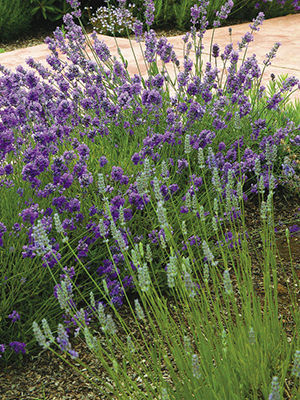
Name: ‘Grosso’ lavender (Lavandula × intermedia ‘Grosso’)
Zones: 5 to 8
Size: 2 to 3 feet tall and wide
Conditions: Full sun; well-drained soil
After trialing several different types of lavender, ‘Grosso’ has proven to be the toughest and the best for flowering and fragrance. I now have nearly 100 of these plants around the garden. Visitors to our home are always remarking on that “wonderful smell” they keep getting whiffs of, and many leave with the intent of planting some of their own.
Lynda Pozel is an artist, avid knitter, and self-taught gardener in Eureka, California.
Photos, except where noted: Danielle Sherry


Comments
Stunning, my kind of garden
Very, very colorful and you accomplished it. I would like to know what variety of lavender you used in the second photo. I don't think that is Grosso. What is it? Thank you for sharing.
Log in or create an account to post a comment.
Sign up Log in