

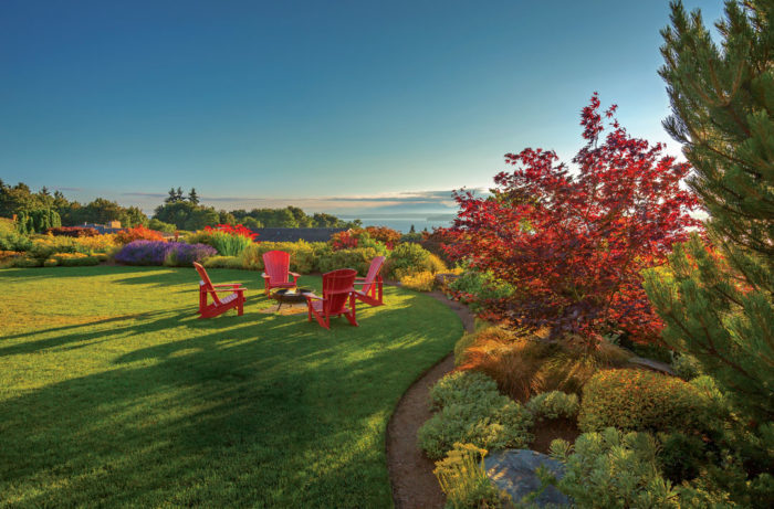
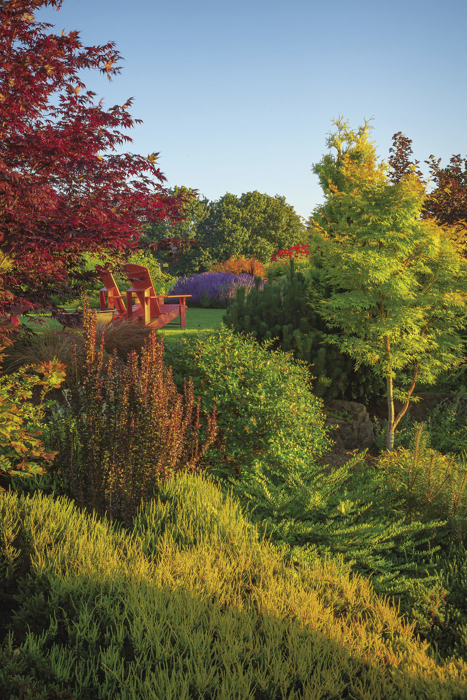
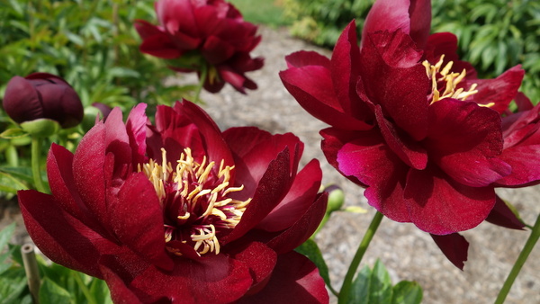
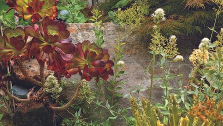
You can’t help but look at the chairs. Placed off to the side of the lawn so that they don’t hog all the space, the chairs are a focal point, mainly because of their color. Red just won’t be ignored. Fire trucks, stop signs, sports cars—if it’s red, it gets noticed. Such a strong color can be a benefit or a detriment to a garden design. The excitement and vibrancy that red creates is easy to overdo. And the many tints and tones of red can even clash with one another. This Seattle garden, designed by Stacie Crooks, does red right. Although it is not the only color in the garden, the red naturally gets primary attention. It connects to the colors in the house and is a color the garden owner loves. While the decision to use so much red was easy, making sure it worked with the design instead of overpowering it required some effort. Here are a few ways Stacie pulls of red in the garden.
Keep red’s vibrancy in check
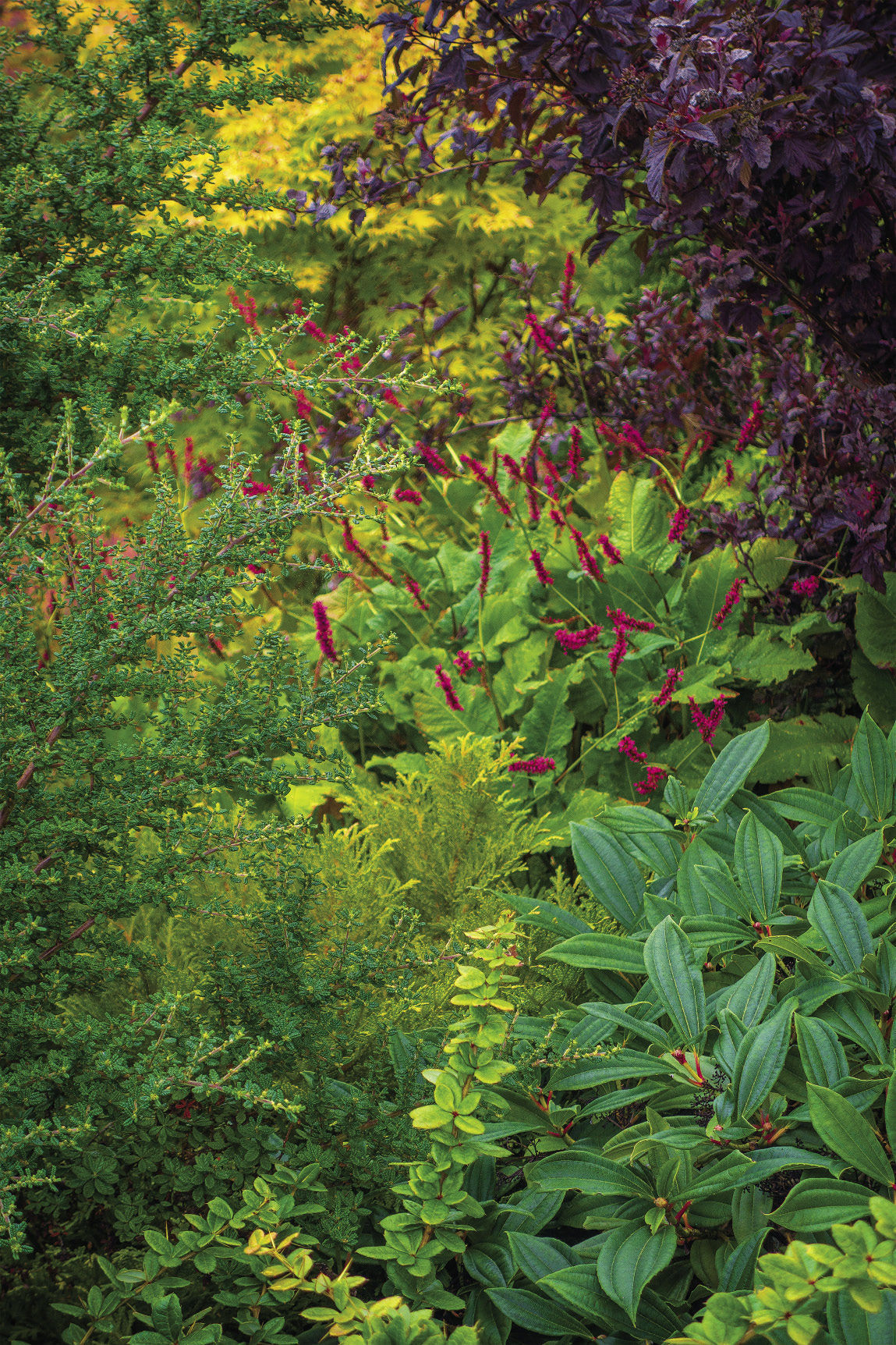
Green, the color you can’t avoid in the garden, is opposite red on the color wheel, which means that it is the perfect option to balance out a color scheme. But just as too much red can be garish, too much green can be boring. So little touches of red, like the blooms of this persicaria (Persicaria amplexicaulis cv., USDA Hardiness Zones 3–8), are just the thing.
Dark shades can be heavy
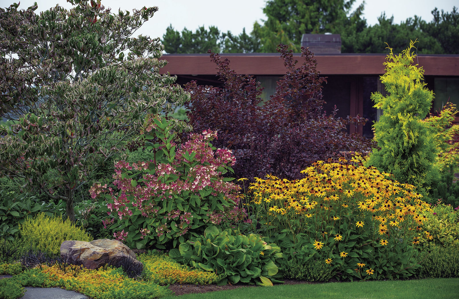 Dark reds can help anchor a planting while still keeping the color scheme going. But remember that dark colors carry a lot of visual weight. Provide gaps to see beyond them, and accentuate them with lighter colors so that those items that you want to feel substantial don’t come across as oppressive.
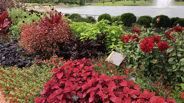
The red you choose determines the design’s other colors
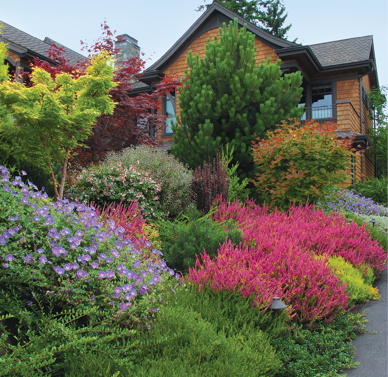
Just as green balances out red, yellow-green and chartreuse provide a counterpoint to blue-red, like the blooms of the heather (Calluna vulgaris cv., Zones 4–7), the controlling hue in this garden. Purple is also perfect for adding a punch of color to a garden dominated by blue-red. After all, purple, as with these geraniums (Geranium cv., Zones 4–8), is made up of blue and red and represents the farthest end of red on the cool side of the color spectrum.
When you want attention, red is the color
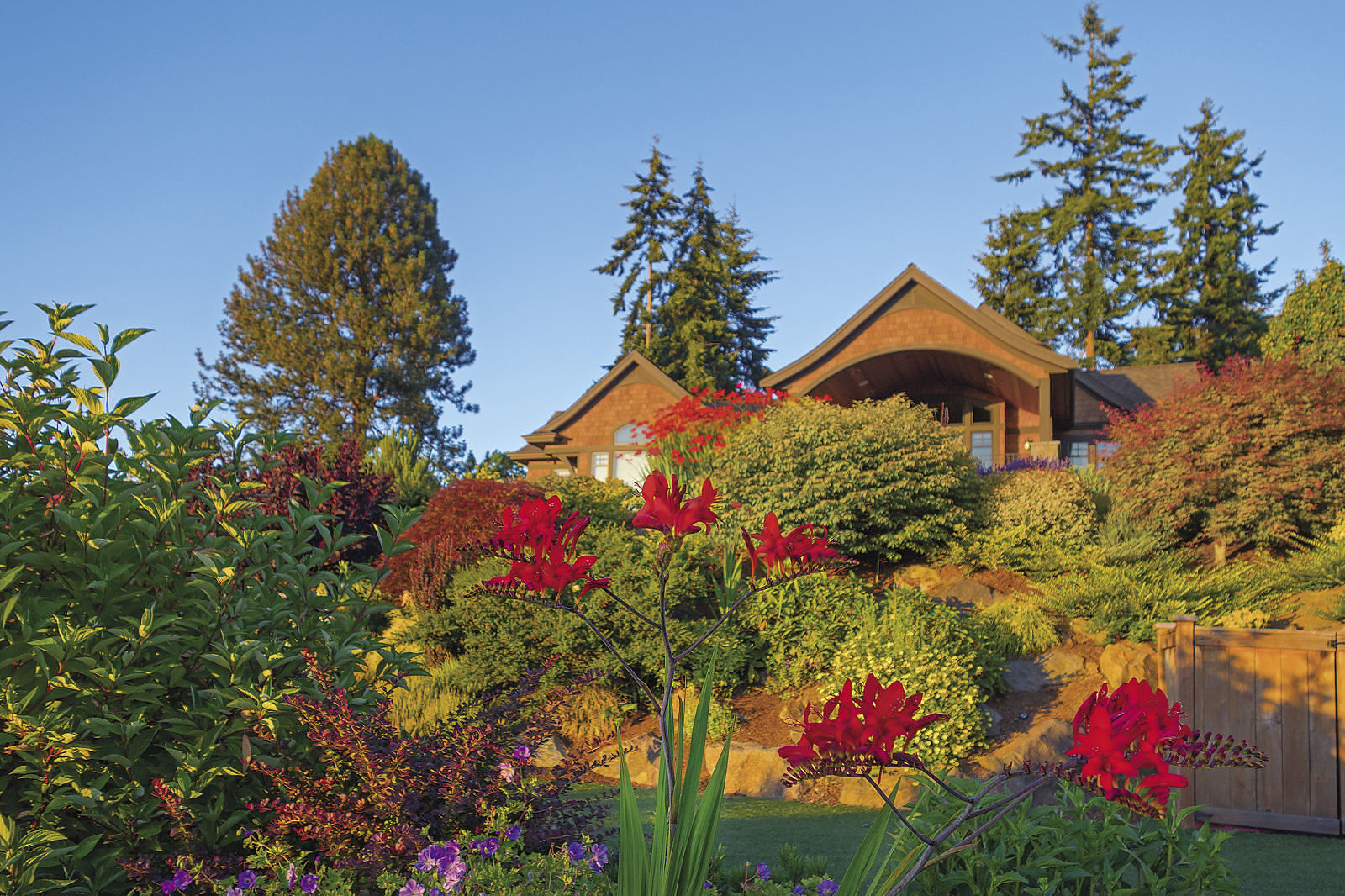
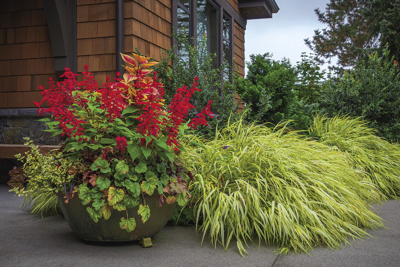
Much of working with red involves pulling the reins on a potentially runaway color. But there are times to ride that color in the direction that it wants to go. No color creates vibrancy or catches the eye quite the way that red does. If you want to draw attention to a particular view, let red do the work (photo above). One perfect place for a dash of pizzazz is near an entryway. Making red the star of a container (photo below) is the perfect way to set the tone.
Use red’s ability to make people look to your advantage. The glimpse through the garden creates anticipation (see photo below). Using muted versions of red around the chairs not only sets the theme but also makes the seating area seem brighter.
Color Is a Continuum
One of the most important things to understand about color is that it is a continuum, with tints melting into tones and tones into shades. Hues gradually morph into others. Fortunately, there is a pattern to how all this works. A color wheel is the best way to see how colors change and how they relate to each other.
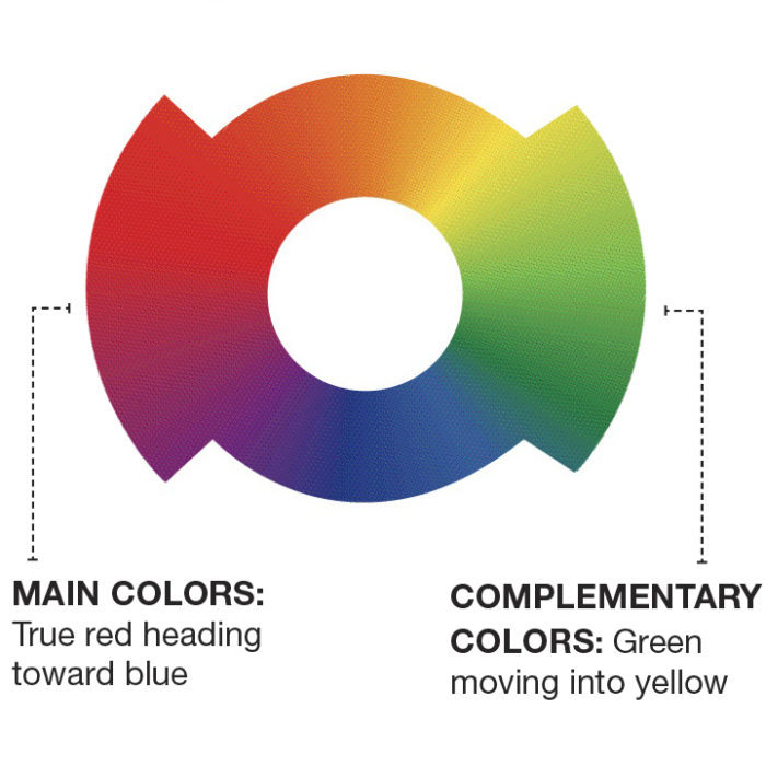
The three primary colors of red, yellow, and blue gradually melt into each other, giving us the secondary colors violet, orange, and green. Between these, one can discern even more colors, such as yellow-green, red-orange, and blue-violet.
Because Stacie chose violet-red (also known as cool red or blue-red) for such a prominent role in this design, that decision steered her toward certain parts of the color spectrum and away from others.


Comments
Log in or create an account to post a comment.
Sign up Log in