
Textural interest and shades of green may be the rage in sophisticated gardens, but I still crave the excitement of floral Technicolor. My personal garden challenge is to work in as many colorful flowers as I can without overwhelming other elements or creating visual chaos. To achieve this, I employ a couple of strategies: I plant in layers, using repeating color patterns to create visual perspective, and I intermingle calming spaces for the eye to rest and structural elements that function as a neutral backdrop.
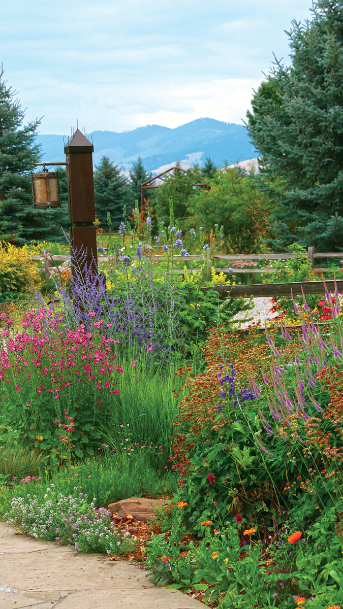
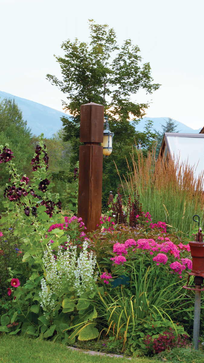
Our Montana valley garden sits within native cottonwood and aspen forests, to which my husband and I have added approximately 150 large conifers. The trees visually tie our garden to the big mountain views all around us, and with this strong backdrop, my flower beds can get away with some extra drama. Even so, I want them to feel well composed. Here are some of my methods for taming the floral display.
Patterns keep bold colors from getting unruly
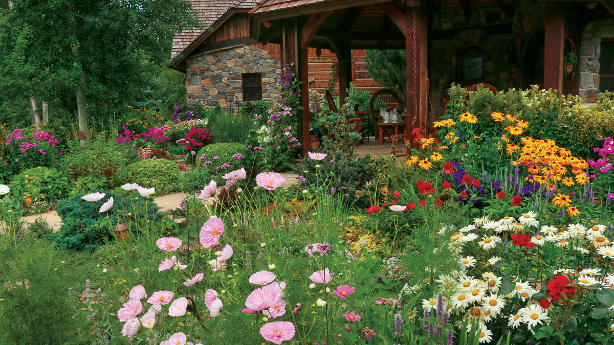
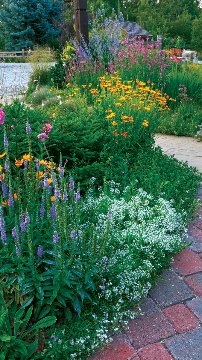
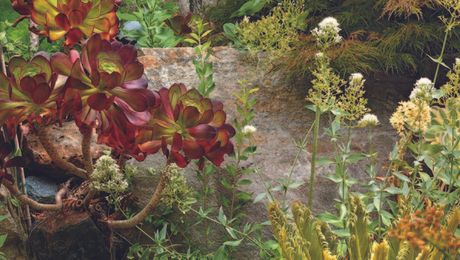
Especially at the height of summer, a bloom-filled, color-saturated garden could cause sensory overload, even for me. To combat this tendency, I include calm ing masses of textural foliage and refreshing drifts of white in my garden beds. Sweet allyssum (Lobularia maritima* ‘Royal Carpet’, annual) is a selfseeder that brightens the edges of paths; shasta daisies such as ‘Becky’ are good for adding a bigger splash of white.
Dwarf conifers such as bird’s nest spruce (Picea abies ‘Nidiformis’, Zones 3–7, facing page) combine big texture with a compact habit, fitting in well with mounding perennials and offering the eye a place to rest amid the flowers. Grasses such as ‘Karl Foerster’ feather reed grass (Calamagrostis × acutiflora ‘Karl Foerster’, Zones 5–9) add neutral notes while echoing the upright forms of blooming bedmates.
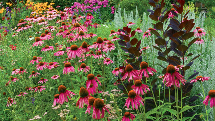
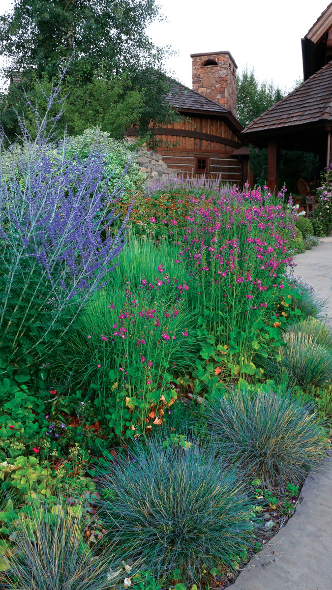
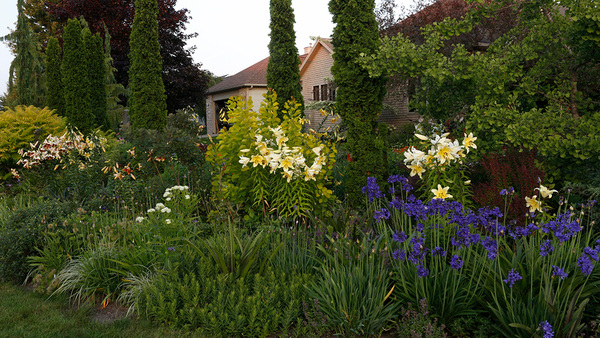
Another way to lend continuity and order without limiting the variety of flower colors I can use is with repeating patterns. Grouping flowers with similar sizes, shapes, and habits can help to unify a scene, even if the blooms are different colors. Paying attention to scale helps too. Layers of short, medium, and tall plants flow through my beds, creating an enhanced sense of perspective. The visual rhythm of these layers echoes that of the natural land scape, helping to tie the garden into its surroundings.
Repeating flower colors can also lend a feeling of continuity. For example, one of my favorite color combinations—rich pink mixed with blue, lavender, and bursts of gold—tends to turn up frequently in my designs. These strong hues call out to each other from across the garden and stand out beautifully against the dark, neutral stone and wood colors of our home.
To help me decide if a color combination or com- position is working, I use a trick that I call my “Monet squint test.” Squinting at a section of garden until edges appear to blend together lends a simplified view that is quite valuable when editing and upgrading garden beds.
When the finer details are blurred away, it is easier to notice color pattens, imbalances, and areas that need more structure or vertical layering. I may notice a spot that needs some extra color, or a repeated color, or a stronger form. This intuitive approach works far better for me than following rigid rules about what colors “go together” or which plants belong in the front, middle, or back of the border.
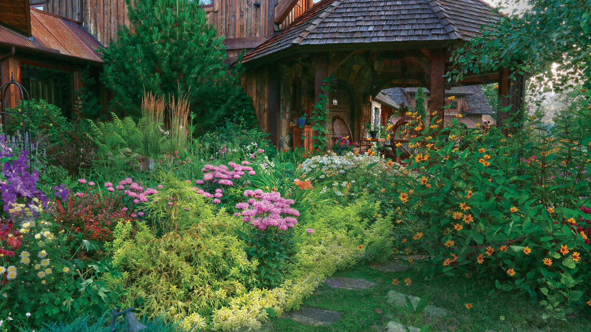
Structural plants tie it all together
My philosophy is that a landscape with appealing architectural interest in winter will also be delightful during the summer months. Therefore, structural plants make up approximately half of my garden plan.
Winter is the best time to review how these structural plants integrate and how they will provide a backdrop for spring and summer flowers. It is also another time when the Monet squint test comes in handy. Without the flowers in the picture, it is easier to evaluate characteristics such as verticality and layering.
Combining colorful seasonal blooms with a more subtle palette of structural plants has helped lend focus to my garden design. If you’d like to try something similar, be playful, pay attention to the colors that make your heart sing, and don’t be afraid to be flower focused.
*Invasive alert: Sweet alyssum (Lobularia maritima)
This plant is considered invasive in CA.
Please visit invasiveplantatlas.org for more information.
Kielian DeWitt gardens 3,400 feet above sea level in Montana’s Bitterroot Valley.
This article first appeared in Fine Gardening #194 as Put the Focus on Flowers


Comments
Log in or create an account to post a comment.
Sign up Log in