
Our world is a riot of beautiful colors, and that extends into the aisles of the garden center. With all those choices to make, however, it can be difficult to know where to begin when designing a container for your garden. Just as authors can get writer’s block, gardeners can get designer’s block when faced with too many options. I’ve found that it helps to limit myself to one color. By choosing a single dominant color or a limited range of similar colors for a container, you’ll narrow your plant choices and find it easier to create a harmonious design.
When starting a container design, the first consideration is, of course, the pot. The safest choice for a color-themed design is one with a neutral tone, like that of concrete or cast limestone, because it will work with whatever plant color you use. Terra-cotta is great, but remember that it is actually orange-hued, so you’ll have to plan for that when choosing your plant colors. If, for example, your intention is to create a soft, frothy blue arrangement and you plant it in a terra-cotta container, the orange color of the pot is about as far away as you can get from blue, so the overall effect of the design might not be what you want. If you’d like a bit more excitement in your arrangements, you can choose a strong-colored container for your designs, but bear in mind that the color of the pot needs to enhance—rather than detract from—the overall effect of the composition.
Orange is hot, hot, hot!
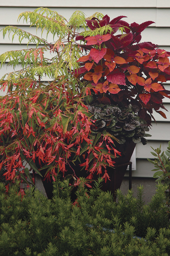
Sumac adds height, texture, and fire to this container—and then turns orange in autumn, amping it up even more. 1. Tiger Eyes® cutleaf staghorn sumac (Rhus typhina ‘Bailtiger’, Zones 4–8) 2. ‘Sedona’ coleus (Solenostemon scutellarioides ‘Sedona’, Zone 11) 3. Big Red Judy® coleus (Solenostemon scutellarioides ‘UF06-40-01’, Zone 11) 4. ‘Black Scallop’ bugleweed (Ajuga reptans ‘Black Scallop’, Zones 3–9) 5. Bonfire® begonia (Begonia boliviensis Bonfire®, Zones 10–11) Conditions: Full sun to partial shade *photo above |

Choose a foundation plant as a starting point
After settling on a container, look for a focal-point plant for the arrangement, one that speaks to you because you love its color, texture, form, or habit. Remember that if you choose a focal plant for its flowers and will be building a color scheme around the blooms, then it should be a plant that blooms all summer, like fuchsia (Fuchsia spp. and cvs., USDA Hardiness Zones 9–11), flowering maple (Abutilon spp. and cvs., Zones 8–11), or geranium (Pelargonium spp. and cvs., Zones 8–11).
I like to shop for the rest of the plants by placing my focal-point plant in a wagon and wheeling it around the nursery, looking for plants with features in the same color family. As you find them, place them in the wagon alongside your focal-point plant. Search for like colors in different shades, tints, and tones. If I’m working with a pure pink focal-point plant, for example, I’ll choose accompanying plants in anything from a pale pink to a deep burgundy. The contrast creates visual interest, and the sameness of the color family lets them harmonize and work well together.
Violet soothes the senses
A blend of red-violets from the cool side of the color wheel maintains a quiet, calm presence. 1. ‘Maple Sugar’ hibiscus (Hibiscus acetosella ‘Maple Sugar’, Zones 9–11) 2. Flowering maple (Abutilon cv., Zones 8–11) 3. ‘Pink Chaos’ coleus (Solenostemon scutellarioides ‘Pink Chaos’, Zone 11) 4. ‘Trailing Queen’ coleus (Solenostemon scutellarioides ‘Trailing Queen’, Zone 11) 5. Geranium (Pelargonium cv., Zone 11) 6. Diamond Frost® euphorbia (Euphorbia ‘Inneuphdia’, Zones 10–11) 7. Shadow Dancer® Violette fuchsia (Fuchsia ‘Goetzviol’, Zones 9–11) Conditions: Full sun |


Rearrange and edit to find the perfect combo
As you shop, keep replacing plants on your cart until you find a pleasing arrangement. Look for plants that will contrast with the focal-point plant in texture and height as well as for those that have similar cultural requirements. Also make sure you have something tall, something of medium height, and a few fillers and spillers. Once you’ve got a basic arrangement together, you can experiment by adding a dash of contrasting color to the grouping to see if you like it, but don’t let it distract from your base colors. Rather than being limited by using only one or two closely related colors, you’ll find that you have many more options than you might have imagined. When you finally settle on your perfect arrangement, pot it up and enjoy.
Purple packs a royal punch
In this blue-violet/red-violet planting, the datura steals the show with its extravagant flowers. 1. Double purple datura (Datura metel cv., Zones 9–11) 2. Persian shield (Strobilanthes dyerianus, Zones 9–11) 3. Angelface® Blue angelonia (Angelonia angustifolia ‘Anblauzwei’, Zones 10–11) 4. ‘Brilliant’ fan flower (Scaevola aemula ‘Brilliant’, annual) 5. Babylon® Purple verbena (Verbena ‘Wynena’, Zones 8–11) Conditions: Full sun |


Play with your pots
One advantage of containers designed with a limited color palette is the opportunity to arrange groupings of pots together in color families and rearrange the groupings over the season to create lovely vignettes. Containers composed of lots of different colors aren’t as easy to combine with each other. I have a 35-foot-long border along one side of my property that holds 50 or so container plantings, and I’ve been working on creating a wave of color that segues from yellow though orange and on to red. You can do this on a smaller scale with only a few containers or expand it to fit your budget and time.
Pale orange benefits from a touch of white
Because pale orange is a tint (orange mixed with white), it makes sense that plants with white accents make good color companions. 1. ‘Souvenir de Bonn’ flowering maple (Abutilon ‘Souvenir de Bonn’, Zones 9–11) 2. ‘Smallwood’s Drive’ coleus (Solenostemon scutellarioides ‘Smallwood’s Drive’, Zone 11) 3. ‘Bella Salmon Shade’ flowering maple (Abutilon ‘Bella Salmon Shade’, Zones 9–11) 4. ‘Galadriel’ fuchsia (Fuchsia ‘Galadriel’, Zones 9–11) 5. ‘Vanilla Twist’ plectranthus (Plectranthus ciliatus ‘Vanilla Twist’, Zones 10–11) 6. ‘Copper Glow’ coleus (Solenostemon scutellarioides ‘Copper Glow’, Zone 11) 7. ‘Sedona’ coleus (Solenostemon scutellarioides ‘Sedona’, Zone 11) 8. Callie® Orange calibrachoa (Calibrachoa Callie® Orange, annual) 9. Variegated dwarf mirror plant (Coprosma kirkii ‘Variegata’, Zones 8–10) 10. Scopia™ Gulliver White bacopa (Sutera cordata Scopia™ Gulliver White, annual) Conditions: Full sun |


Think you’ll feel stifled by choosing just one color? Think again. If you design a container with one color, your combinations are bound to be harmonious and successful, no matter what color you choose—and that’s exciting.
One Color Yields a World of Choices

Once you’ve picked the color that speaks to you, open your eyes to all of the options within that color and choose plants from the entire range for your design. Just as you need a variety of textures for a successful arrangement, a variety of tints, shades, and tones will make your plant combinations dynamic and interesting.
Tint
What is it? A tint is any pure hue or color with white added to it.
How can you use it? Arrangements using tints are soft and subdued, and they rest easily on the eye. They are simple to design with because contrasts aren’t as strong. Add a tint to your combo when things are feeling a bit too heavy or dramatic.
Shade
What is it? A shade is any pure color with black added to it.
How can you use it? Color schemes using shades display an overall dark and somber quality. Used well, they can create dramatic designs, especially when placed against a lighter backdrop. Add a shade to your combo when things are feeling a bit too light and airy for your taste.
Tone
What is it? A tone is any pure color with gray (white plus black) added to it.
How can you use it? Tones are less intense and more subtle than pure hues and therefore easier to design with. Most of the colors we choose for interior decorating are tones. Use a tone to unite your design, bridging the gap between a pure color and a strong tint or shade.
Deanne Fortnam is a master decorative artist who puts her love of color to use in her Nashua, New Hampshire, garden.
Photos: Deanne Fortnam


Comments
Log in or create an account to post a comment.
Sign up Log in