Apologies for being a year late with this post. Good intentions and all that, but I’m here to redeem myself.
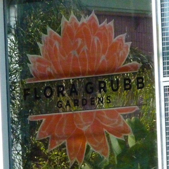
Last year, while attending the San Francisco Flower and Garden Show, a Bay Area friend lured me to Flora Grubb Gardens. “You HAVE to go. You’ll go nuts!” she’d breathlessly implored me for years.
On my 2010 trip, Mara and I hooked up at Flora’s. The place just knocked me out (which might explain why I spaced for a year and didn’t blog a word about my visit).
It’s about time I paid homage to The Divine Ms. Grubb and her matchless approach to horticulture, gardens, and the educational value of inspiring displays.
But First, a Few Words About the Show…
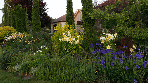
If you missed Cool Green Gardens for the past few months, you’ve escaped my incessant badgering hoping to entice readers to put their lives on hold for a week and join me at the San Francisco Garden Show. (I’m happy to report that some of you DID! Nice to meet you, and I hope you enjoyed your sneak peek at the May/June issue of Fine Gardening magazine.)
My main business at the show was presenting a two-part workshop focusing about how to “purchase with purpose” – the idea that plants can do more than just look pretty. They should do stuff, like cast cooling shade, soften strong winds, or hold a slope. I reinforced the necessity of making sustainable plant choices, assuring that plants would thrive where you plant them.
That was the unsexy, but important stuff. There were also lots of ooohs and aaaaaahs when I explored the design principles that make gardens into works of art and style. The PowerPoint popped.
So while my brain is still pulsing with great design ideas, I thought I’d show you a few pictures I took at Flora Grubb Gardens last Friday, and break down what’s going on, design-wise.
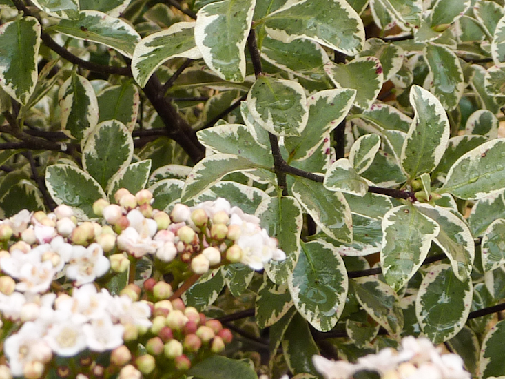
Design Lesson 1: Milking White
When I look at a plant composition that I like, the first thing my brain does is dissect how harmony and contrast come into play.
Maybe it’s the writer and teacher in me analyzing everything, but it feels like every inch of Flora’s isn’t meant to just be beautiful, but is arranged to educate shoppers and to up their game. It’s evident to me that not a pot, plant, or stick of furniture is just “set down” somewhere – every plant combination and tableau is an creative idea a customer can try on and bring home.
Like this pairing of white Viburnum tinus flowers and the variegated leaves of Pittosporum tenuifolium ‘Marjorie Channon’. We’re looking at the effect white has in the garden when it’s combined with any other color. White acts as a neutral accompaniment that intensifies nearby colors, in this case green. This design principle translates to any growing zone, since variegated and white-flowering plants are available almost everywhere. Contrast is key.
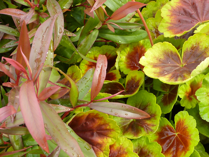
Design Lesson 2: Heat Seeking Trio
Why does this killer combo make me melt? I guess it’s the way Flora’s crew pulled off a textbook example of color theory, marrying the same narrow range of harmonious shades and tints that make fall color displays so exciting. Gold-tinged-with-lime leaves dominate eighty percent of the frame. The lower corner of the composition is anchored by a bronzy orange leaf, adding strength and contrast. In pops a shockingly cute cluster of rose-pink blossoms, made more intense by the light background leaves. How would you rescale this to be the foundation of a larger composition in your garden?
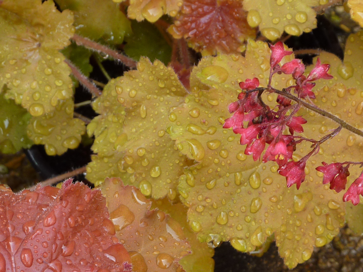
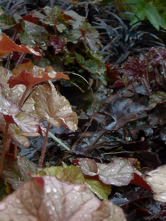
Design Lesson 3: Start Your Wining
A few steps away, the Heuchera hubbub continued. As will immediately become obvious, I don’t know much about wine, but this color pairing – call it merlot meets rosé — just speaks of a strong oak nose (aka Pinocchio) and notes of Froot Loops. Notice how the veins on the lighter leaves (H. ‘Pinot Gris’, so it is about the wine!) are drawn with the same color as H. ‘Molly Blush’, creating a bridge between the two varieties. This is a subtler play of contrast, especially since the leaves’ shapes and sizes are identical.
Design Lesson 4: Polar Expedition
And sometimes it’s all about the contrast. When you look at a color wheel, you’ll see that yellow-green and red are nearly polar opposites of each other (the complement of red is actually true green). The contrast is deepened by the darkest shade of red – maroon – and a pale tint of chartreuse, accentuating their differences. The narrow leaves of the dwarf peppermint tree (Agonis flexuosa ‘Nana’) repeat the color at the center of the Pelargonium hortorum ‘Indian Dunes’, adding another level of interest with its distinctly different leaf shape.
Design Lesson 5: Kick the Door Open
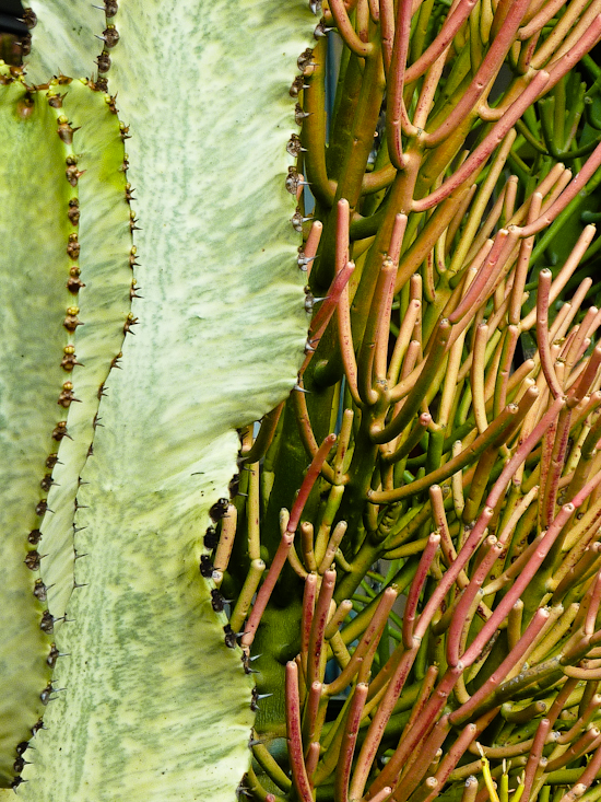
Sometimes ya just gotta come in with both barrels blazing, like this striking mash-up of a silky green, variegated form of Euphorbia ingens, and I-forgot-my-sunscreen-colored E. tirucalli ‘Sticks on Fire’. Other than their shared genus and upright architecture, these two plants couldn’t be any less alike: curving planes vs. cylindrical branchlets; creamy vs. smoldering; spiny vs. smooth.
So stingy brim hats off to Flora Grubb and her sophisticated design crew. If you’re anywhere near San Francisco, don’t miss a chance to see this wonderland for yourself – it’s like winning a full scholarship to a masters class in design.
Announcing the winner of Nan Sterman’s book…
On January 31, I reviewed Nan Sterman’s California Gardener’s Guide, Volume II, and offered a free copy to a randomly drawn reader who left a comment at the blog post. After receiving 27 comments from folks eager to add this great reference book to their library, I fired up my random number generator on my iPhone and up came with Lynn VonHoogenstyn of Cloverdale, California. Congrats to Lynn; I can’t wait to see the results.


Comments
Log in or create an account to post a comment.
Sign up Log in