

Cohesion in a garden can be difficult to achieve. A design can appear either too homogenous or too disparate. The latter is especially true for us gardeners who are collectors. The answer lies in what I call “meaningful juxtaposition.” I break down the concept of juxtaposition, or comparison-contrast, into four parameters: size, shape, color, and texture. Whether plants or hardscape materials, all garden elements possess these four parameters. Matching all four can be predictable, mediocre, and boring—rather like purchasing a matching furniture suite from a big-box store. But if none of these parameters relate, a garden can look like the markdown rack at a garden center. Aiming for garden cohesion begins with matching two of those four parameters and varying the others. Doing so produces enough interest to draw the viewer into the unexpected, the tactile, and the magical. Who doesn’t want to add a measure of magic to their garden? Let’s explore each parameter and how to employ it successfully.
With size, it’s all relative
Size deals with the scale of the individual element as well as how the element relates to the space into which it is placed. Historically, interior designers touted the wisdom of using only small-scale furniture in a small room. While this is a safe approach, it is far too predictable and uninteresting. Actually, overscaled pieces can add unexpected interest and drama to a small room if done thoughtfully.
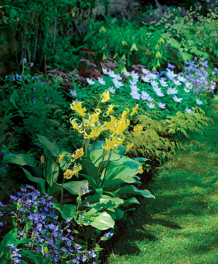
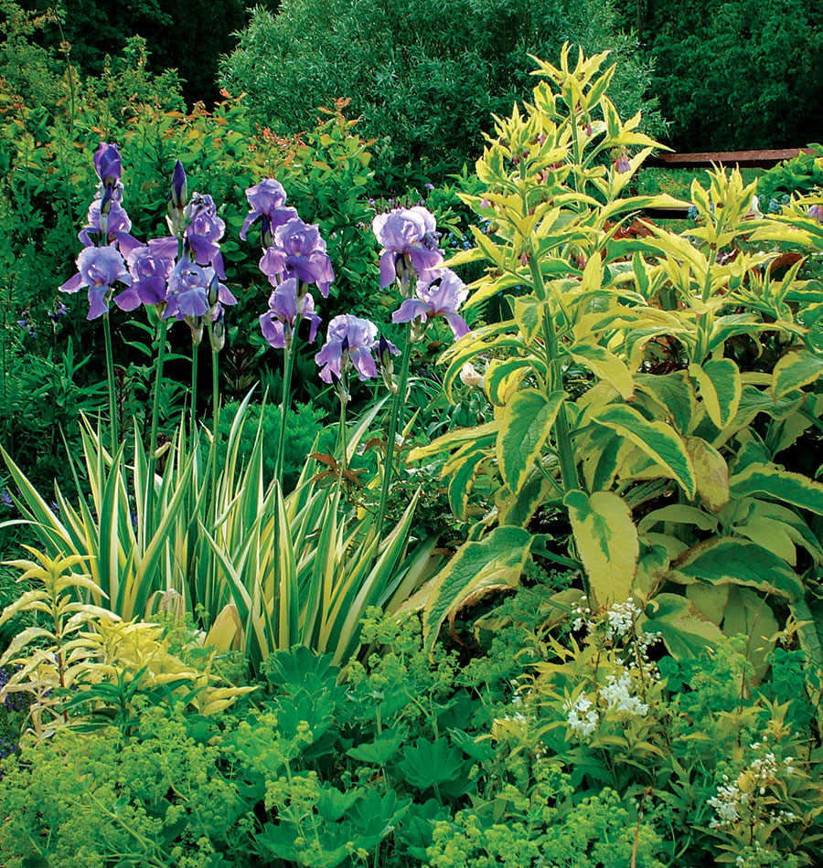
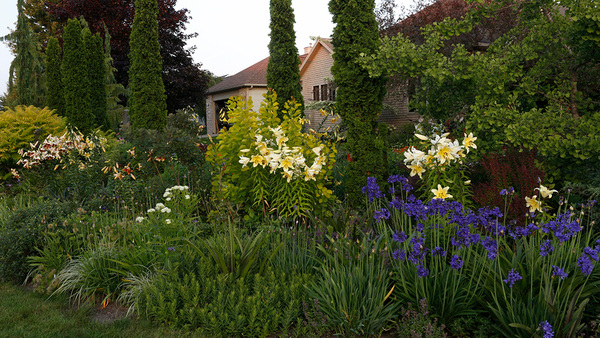
And so it is with the garden. Examples of sizematching abound, particularly in traditional and formal gardens. Think of allées, pollarded trees, and boxwood (Buxus spp. and cvs., Zones 4–9) gardens. Such gardens can be pleasant and even tranquil, but rarely are they intriguing or imaginative. Size-matching can be a great tool when employed in a collector’s garden. For example, thoughtfully placing similarly sized boxwoods among a chaotic collection of conifers can introduce rhythm and become a common thread to weave a disparate collection into a cohesive and tranquil garden.
If done in a way that captures attention, combining plants of contrasting sizes can read as both sublime and profound. The key to doing this successfully is to make sure the difference is readily noticeable and that the plants relate with regard to other parameters.
Use shapes to elicit emotions
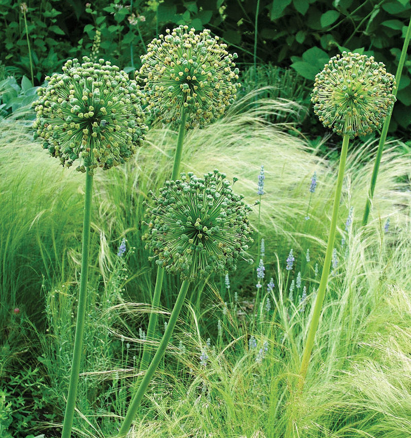
Shapes inspire the imagination and elicit emotion. This is why I have such a love for weeping, gnarled, contorted, and prostrate trees. I tell clients that such trees raise arthritis to an art form. In particular, I find the spherical shape quite nurturing, probably because it conjures faint prenatal memories of being in the womb, where all our needs are met without any effort on our part. Again using boxwood as an example, ballpruned boxwoods can easily be interspersed with stone spheres. Doing so can inject a contemporary feel into a traditional or transitional garden. For additional interest, conical boxwoods can be added to create contrast.
Leaf shape can also be matched. For example, boxwoods, Japanese hollies (Ilex crenata and cvs., Zones 5–8) and dwarf yaupon hollies (Ilex vomitoria cvs., Zones 7–9) all have a similar leaf shape as well as overall form, and all may be used successfully in a single garden. The key is to group the same plants together and space these different groupings widely apart. You don’t need to try too hard to make the connection. The subconscious minds of your garden visitors will do the work for you. This kind of cohesion, without being monotonous in its repetition, will give your garden its sublime sense of place.
Color can come from hardscape
Color is generally the most noticeable, and most sought after, feature in most gardens. To paraphrase a well-known quote, I believe that color frequently is the opium of the people.
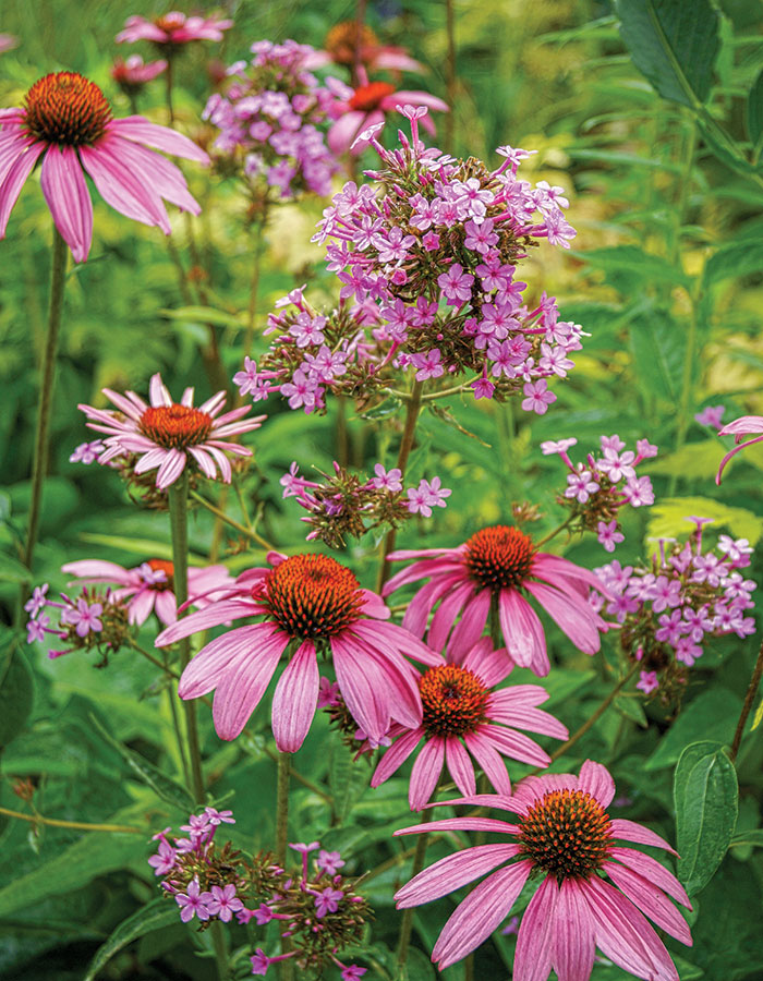
A quick study of the color wheel will give you a working knowledge of how to employ color to accomplish your garden goals. Complementary colors are those that are opposite one another on the color wheel. Red and green are complementary, for example. Analogous colors are those that lie close together on the wheel, such as blue and purple. Using complementary colors as garden accents creates interest and pulls the eye toward certain areas. Using analogous colors produces less “pop” and yields a more tranquil feel.

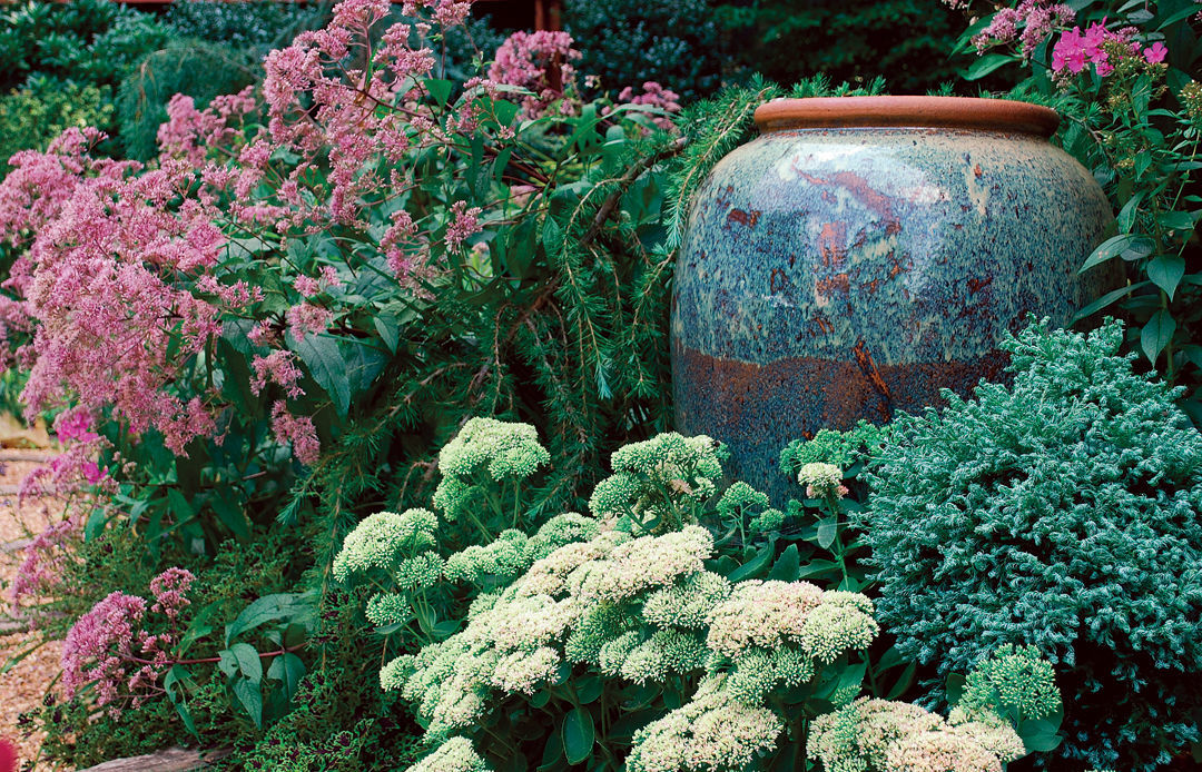
For year-round interest, I suggest a good blend of both flower and foliage color. Foliage color is frequently transient throughout the year and should be celebrated. This is especially true with regard to plants such as Japanese maples (Acer palmatum and cvs., Zones 5–9), pieris (Pieris spp. and cvs., Zones 5–9), and some conifers. Therefore, pairing these plants with suitable bedmates or even hardscape should be a priority. In my garden, I’ve planted a red-leaf Japanese maple near a set of antique Chinese doors encased with a Chinese red frame. For several weeks in autumn, the vignette puts on quite a show. A more permanent example of matching foliage color to hardscape is the use of a low-spreading blue-needled conifer that drapes over a bluestone terrace. The color matches, or nearly so, accentuating the textural differences.
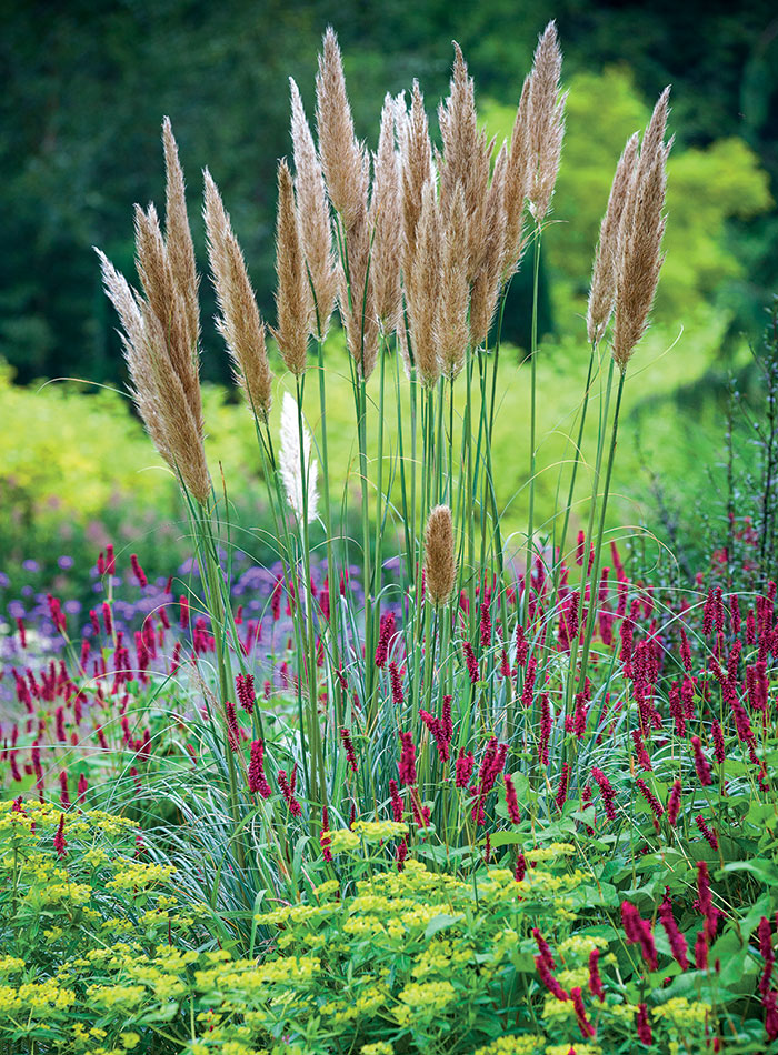
Dark green reads as tranquil to our brains and gives the eye a place to rest between pops of color. It also visually recedes and, by doing so, can make a space appear larger than it actually is. When dealing with transient foliage color, dark green is a lifesaver in that it provides stability to the vignette. However, a garden with an excessive amount of dark green can appear uneventful and predictable. The addition of some lighter greens such as chartreuse is a quick fix.
To see whether your garden relies too much on color at the expense of size, shape, and texture, take your camera into the garden and view the resulting photos in black and white. Does your garden still look cohesive and your design intentional?
Texture can be tricky
Texture is one of those concepts that is difficult to grasp and define. It relates both to how something feels and to how it appears to feel. Thus, a smooth ceramic container with a crackled glaze could appear to be highly textured even though it has a low textural quality when actually touched. Texture can be matched in two ways: either by degree of texture or by actual, similar texture. When working with degree of texture, you could pair a highly textural conifer with a roughly glazed container. This would work because both elements feel rough and perhaps even a bit uncomfortable when you run your hand across them. Consider using disparate plants with matching textures. Similar texture can be the cohesion that holds a vignette together.
Pulling It All Together
In the quest to create a sublime and cohesive garden with a dose of the unexpected, a good starting point is to match two of the parameters and to vary the other two. If when you have reached this point the individual elements read as too strong, you may want to match a third parameter to create more continuity and dilute the degree of contrast. If at this point the individual elements read as too weak when viewed as a whole, you may want to contrast a third element to create more noticeable interest. Consider this glass installation.
Too much contrast (below left)
The blown-glass leaves perfectly mimic the shape and texture of the cast-iron plants in which they are sited. The sizes and colors of each element vary. Because red and green are complementary rather than analogous colors, the vignette appears too jarring and needs more continuity.
 |
 |
Too much harmony (above right)
In this photo, the solid-red glass has been replaced with two-toned glass that picks up the chartreuse of the surrounding ‘Florida Sunshine’ illicium (Illicium parviflorum ‘Florida Sunshine’, Zones 6–9). Now color, shape, and texture all match, with only a small amount of red to draw the eye. The color is so analogous that the red appears to be floating aimlessly over the top of the vignette instead of making a thoughtful connection to it. More contrast is needed to give this vignette the place of honor it deserves in the garden.
Just the right balance
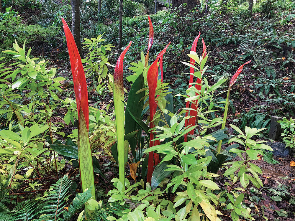
The final installation shows a mixture of the two types of glass. There is enough chartreuse glass to make a color connection with the surrounding foliage. The solid-red pieces ground the mixed pieces by pulling the red down to ground level. Finally, the glass mimics the shape of the cast-iron plant leaves. The installation has now become an appropriate focal point in this woodland garden.
*Invasive Alert: Cortaderia selloana ‘Patagonia’
This plant is considered invasive in AL and CA.
Please visit invasiveplantatlas.org for more information.
Jay Sifford designs gardens in Charlotte, North Carolina.
Photos, except where noted: Jay Sifford


Comments
Log in or create an account to post a comment.
Sign up Log in