
Photo/Illustration: Melissa Lucas
Red is one of the oldest colors used by humans: Prehistoric horses drawn in red pigment still gallop across the ancient cave walls in Lascaux, France. To poets from William Shakespeare to Robert Burns, it is the color of passion; to seafarers, it is an omen: “Red sky at night, sailor’s delight; Red sky at morning, sailors take warning.” Throughout its long history, red has been associated with highly charged emotions and a sense of urgency. Today, red still commands the attention of motorists and pedestrians at traffic lights.
Some gardeners are put off by the same assertiveness that makes red effective in controlling traffic. Others embrace the challenge of working with such a vibrant, exciting hue. Pure, primary red sends out a clear signal that says: “Stop! Look at me!” This effect works well with containers planted in red. They cheer up the entrance to a house or call attention to window boxes placed against neutral siding. But in the garden, pure red can be overpowering, especially if the flowers are large. The larger the flower, the more dominating the color, which is why it’s hard to place Oriental poppies (Papaver orientale) in a mixed border.
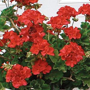
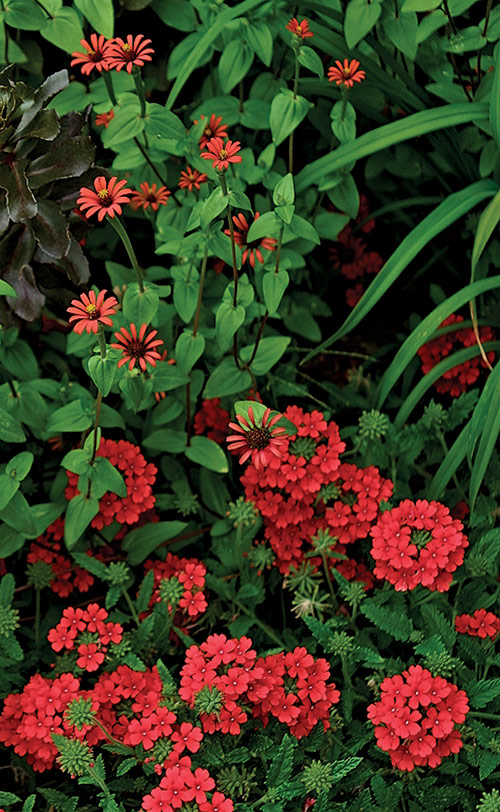
Red geraniums (Pelargonium cv.) stand out against their own green leaves in a classic contrast.
Photo/Illustration: Steve Aitken
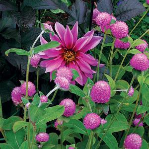
The cool, bright pink blossoms of Dahlia and Gomphrena cultivars are matched in hue but different in shape, standing out against complementary green foliage.
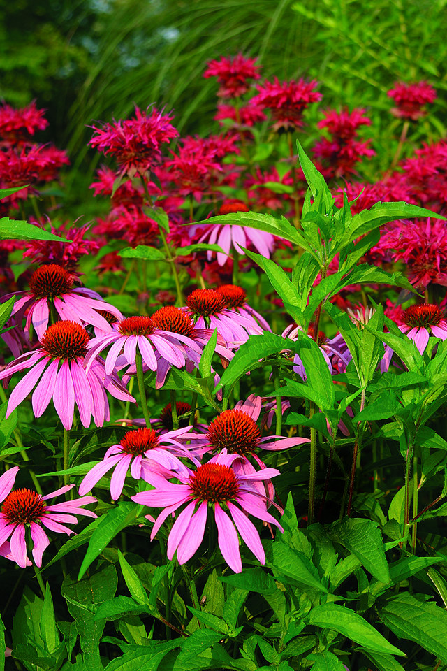
Primary red is at its best set off by complementary green leaves or in contrast to white or in harmony with dark shades of blue-violet. It also lends itself to hot color harmonies with oranges and orange-yellows—think daylilies (Hemerocallis cvs.); true lilies, such as ‘Fire King’ (Lilium ‘Fire King’); coneflowers (Rudbeckia cvs.); and torch lilies (Kniphofia spp. and cvs.).
But red has many faces and can be a tricky color. Besides true red, there are warm reds and cool reds. Warm reds have yellow in them—scarlet is an example. Scarlet is compatible with true red, its closest relation, and goes well with other hot colors. It should be no surprise that it combines harmoniously with orange in all its tints and hues—orange is, after all, comprised of yellow and red. For contrast, try warm reds with green and with yellow-green.
The red family
Printer’s ink cannot do justice to the color red, but the chart below suggests the breadth and depth of its range. At the top of each column are the full-bodied colors; beneath them are tints (white added) of each. Seeing the reds laid out in sequence, you can appreciate the splendid range of this family and also the problem it presents to gardeners. Without pure red and its pink tints as a buffer, the cool reds and pinks would clash with the warm reds and pinks.
COOL RED: Cool red, or crimson, contains blue. It is a good partner for deep blue and violets and is stunning with yellow-green, its opposite on the color wheel.
Photo/Illustration: Melissa Lucas
MEDIUM COOL RED: This tint is light and bright enough to enliven cool, heavy color schemes involving dark blues and violets.
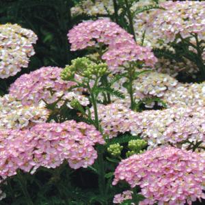
Photo/Illustration: Melissa Lucas
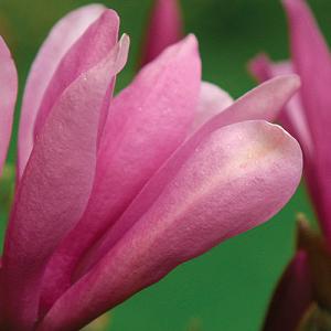
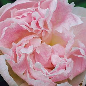
TRUE RED: True red is a pure, primary hue that cries out for attention. Its obvious color partner is true green.
Photo/Illustration: Janet Jemmott
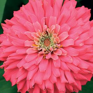
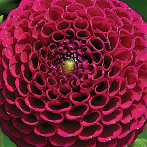
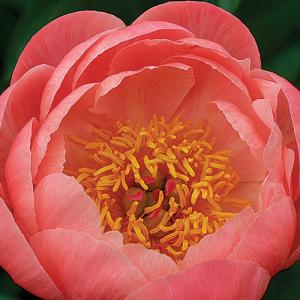
MEDIUM TRUE RED: This vivid pink tint is almost as eye-catching as red. It could serve as a bright spot among softer pinks or as a foil for white.
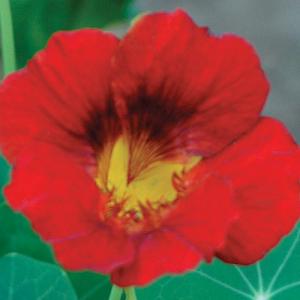
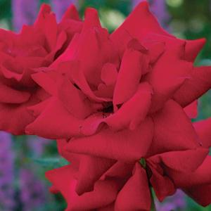
WARM RED: Add a touch of yellow and this hue becomes scarlet, the most attention-grabbing member of the high-profile red family.
Photo/Illustration: Michelle Gervais
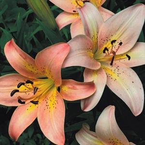
MEDIUM WARM RED: This tint, which is a pale version of coral, would harmonize with warm yellow and orange hues of similar intensity and would contrast with blues and violets.
Cool reds contain blue. Cool blue-red, or crimson, is a rich, regal, rather dark color. In the garden, crimson is less aggressive than scarlet and recedes slightly. Because it contains a bit of blue, crimson is compatible with blue and most of the violet family. Crimson roses work harmoniously with blue lupines (Lupinus spp. and cvs.), purple and blue delphiniums (Delphinium spp. and cvs.), and clematis (Clematis spp. and cvs.) in the same color range. For a stunning contrast, pair crimson and cool yellow or crimson flowers with chartreuse foliage, a near-complementary association linked by cool hues.
Crimson and scarlet are magnificent hues. But be forewarned, they are profoundly incompatible. The yellow in scarlet creates a color that leans toward orange while crimson leans toward blue. Don’t forget that blue and orange are complete opposites on the color wheel. And unless you are skillful, pairing reds with blue in them and reds with yellow in them could clash mightily. Nor are pinks exempt from this rule. The caveat about keeping warm and cool reds apart also applies to warm pinks and cool pinks.
Pink can not be omitted from our discussion because it is a tint of red. The strongest pink tints are the hardest to use successfully in the garden. Most are saturated and vivid, but being lighter than red, they show up at an even greater distance. Keep the warm pinks with other warm colors, such as tints of orange and warm yellows. Blue-pinks are lovely with orchid, mauve, and tints of blue-violet.
It is fun but risky to combine reds and pinks. The secret is to match exactly the red and the pink. Just remember to keep pure red with a pure pink, warm red with a warm pink, and cool red with a cool pink. Try experimenting with zonal geraniums. Put the reds and pinks in separate pots—that way you can move them around if they clash.
Photos by Jennifer Brenner except where noted.
From Plant Combinations, Vol. 2


Comments
Log in or create an account to post a comment.
Sign up Log in