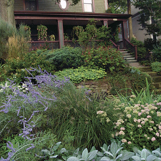
Soon after I moved into my 100-year-old home, I decided to have its brown-and-white exterior painted. In considering my color options, I looked to my preferences and to colors that would suit the venerable style of the architecture. Equally important was my decision to coordinate the palette of my garden and house for an artful appearance and cohesive design.
One way to link a house and garden is to use paint colors that can be repeated in foliage or flowers. For my house, I chose a silvery moss green accentuated by a burgundy trim. I knew that these colors would suit my home’s charm and provide a fitting background for the garden I envisioned.
Your house color is a backdrop for your garden
Another, easier way to link your garden and house is to match your plant colors to house colors. As you select a plant palette, your biggest decision may be to determine how many colors to include. I find that simple color schemes often work best. Palettes may be sophisticated, natural, or dramatic, depending on your style. I recommend buying a color wheel at an art-supply store and using it to identify colors that will offer pleasing harmony or contrast to your house.
House colors that are easiest to integrate with a garden are the greens, browns, and beiges of nature. When a house already blends with the surrounding landscape, the color provided by flowers is needed only for contrast. In this instance, most colors that show up well against your house will work.
Pastel-colored houses are colorful yet can also softly meld into the natural landscape. When dealing with a pastel-colored house, the garden’s color scheme should relate to—or contrast nicely with—the house color. A cool house color, such as blue, green, or purple, works well with cool plant colors because they are harmonious. Similarly, houses painted in warm colors of light yellow, pink, or apricot would harmonize with plantings that feature warm colors. To liven things up, combine colors that are opposite each other on the color wheel. A blue house paired with orange flowers, for example, provides maximum contrast.
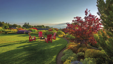
Bright house colors are dramatic and should be paired with equally spectacular colors in the garden. Repeat the house colors as closely as possible and for as long as possible through the year. With a bright house color, I like to include rich plantings of annuals in long-lasting, vivid hues. Sometimes I also add slightly deeper shades of these colors, especially through the use of foliage.
Muted colors or those with gray in their pigment are more versatile as backdrops than pure pastels or very bright colors. An exact match between plants and paint is not as important with muted shades; they tend to coordinate with slightly differing hues, much as a tweed coat does.
Brick houses often fit in this muted category. Usually relating to the “hot” side of the color wheel—orange, red, and yellow—brick houses are best planted with other hot colors. Precisely matching the brick color and plantings is not necessary.
Varying your planting colors
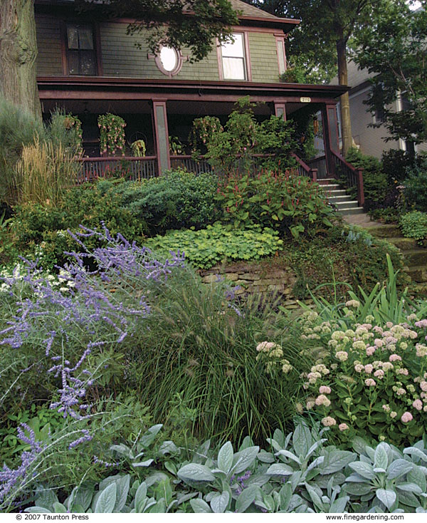
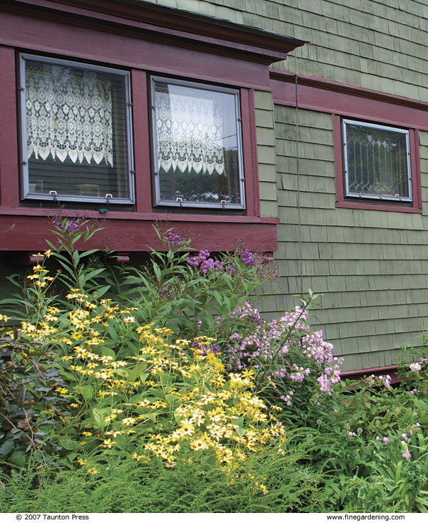
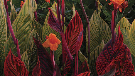
The green and burgundy of my house make good backdrop colors for planting schemes. As the predominant color of nature, green serves to unify any landscape. Red is the complement of green—its opposite on the color wheel—and thus offers strong contrast. However, the subdued form of red I chose—a ruddy burgundy—paired with a silvery moss green creates a complementary scheme that soothes rather than shouts.
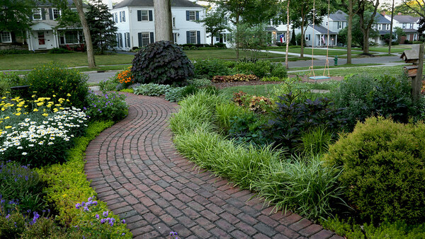
Subdued neutrals in front
In our front-yard cottage garden beneath the canopy of a Norway maple, greens with silver-gray foliage brighten the scene. Key plants include silver-leaved lavender cotton (Santolina chamaecyparissus, USDA Hardiness Zones 6–9), silver sage (Salvia argentea, Zones 5–8), and a silver-gray juniper (Juniperus virginiana ‘Grey Owl’, Zones 3–9). Plants with hints of burgundy include Sedum spurium ‘Dragon’s Blood’ (Zones 4–9), bugleweeds (Ajuga spp. and cvs., Zones 3–9), and Heuchera cultivars (Zones 3–8).
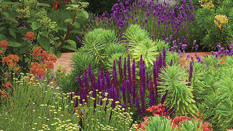
Dynamic contrast at the side
Purple and yellow are the key colors in a sunny, south-facing border between the driveway and the house. From spring’s golden daffodils and mahogany and yellow tulips through the fall spectacle of purple asters, goldenrod (Solidago rugosa ‘Fireworks’, Zones 5–9), and Rudbeckia ‘Herbstsonne’ (Zones 3–9), there’s always an interplay of contrasts. Two dark-leaved woody plants—a purple smoke bush (Cotinus coggygria ‘Royal Purple’, Zones 5–9) and a purple beech (Fagus sylvatica ‘Purpurea Pendula’, Zones 4–7)—repeat the trim color and anchor the far ends of this border.
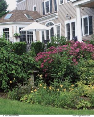
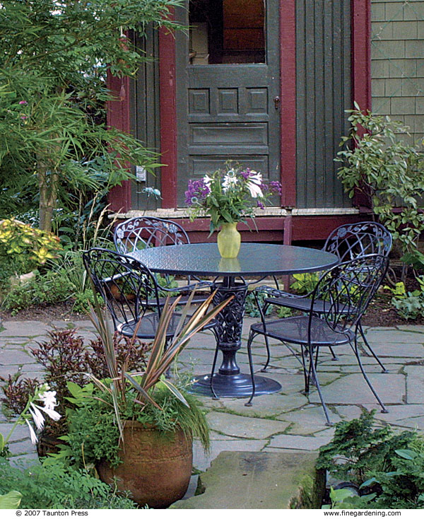
Bright highlights in the back
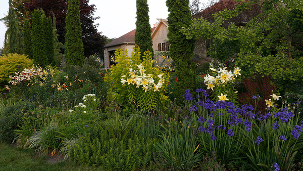
White draws the most attention and should be used with care. I look to white primarily for a focal point or to unite a space. In our back garden, which surrounds a patio, I use this potent color sparingly and as a connector. The repetition of the white blooms of hosta (Hosta cvs., Zones 3–9) and other plants throughout the season is offset by sprinklings of violet-purple flowers and accents of burgundy foliage.
How to work with white
White is a strong color that draws the eye and is the last color visible in the fading light of evening. When I design a garden for a white house, I use white as a repeating element. I weave drifts of white flowers, white-variegated foliage, and white garden structures throughout the space to link house and garden.
The repetitive use of white in the landscape also works well for pastel houses and for those with white or off-white trim. Or you may prefer to use white as a dramatic accent; a mass of white petunias can lead the eye to your front door.
For houses painted in dark shades, stark white may offer too much contrast. White is too shrill against my somber green house. I use it sparingly; I often use creams and yellows to provide the brightness of tone needed for contrast.
I approach garden design in the same way I choose jewelry and accessories to accent an outfit. Most of all, I have fun with the process. My goal is to imaginatively link a house and garden to create a lovely ensemble.
For common house colors, which planting colors look best?


You don’t need to repaint your home’s exterior to create a pleasing scheme with your garden. Work instead with the existing colors of your house, and choose plants that coordinate with them.
If possible, repeat the color of the trim or roof throughout a garden. I recommend the use of white or off-white plantings as accents or unifying elements with any house that has white or cream in its paint scheme.
To spur some ideas for palettes, I’ve selected several potential planting schemes for each of six popular house colors.
Beige or green
Neutrals are the easiest colors to plant against because flower and foliage colors are needed only for contrast. Repeat roof or trim colors in plantings. A classic color scheme would include violet blue, soft rosy red, lavender, and yellow plantings. Avoid using too many bold colors.
White
An abundance of white or pastel blue, yellow, and pink plants will unify the house and landscape. Avoid only dark, rich colors because they will look harsh against white. It’s fine to use darker colors sparingly, as small, sharply contrasting details. Foliage that is blue, silver, or variegated also makes a good accent.
Yellow
Almost any color goes well with a yellow house. Contrasting plantings of lavender and purple, which is yellow’s opposite on the color wheel, will make a dramatic statement. Use golden- or cream-variegated foliage to add more yellow to the landscape.


Brick red
Hot colors—oranges, yellows, scarlet—are naturals against brick, as are the more mellow peach-pinks and soft yellows. Violet-blue flowers or burgundy leaves make good accents. Avoid cool purple-reds and lavender-pinks because they may clash with brick.
Brown
Many soft colors work well against brown. Using pale and deep pinks and yellows, along with burgundy, will create a rich and mellow look. Purples or reds may not show up well against brown but may be fine as accents.
Blue
When planting against a blue house, take a strong cue from the color wheel. Choose blue’s color-wheel opposite—soft orange, golden yellow, copper—for an energetic look, or choose neighboring colors—lavender, blue, purple—to cool down the scene. Silver or blue-green foliage makes a subtle accent. Burgundy may be difficult to integrate well.


Comments
Log in or create an account to post a comment.
Sign up Log in