The color wheel can only take a garden so far. When it comes to pairing hues, it is certainly a helpful tool. But too often, using colors, not picking them out, stumps gardeners the most. As a designer, I don’t believe in rules or obsess over color theories. In my experience, almost any color combination can work. I do, however, design within a few basic parameters. These self-imposed restrictions strive for the same goal: to establish a sense of order. That is the secret to successfully working with color. It’s what often separates amazing gardens from those that seem off or cluttered.
 |
1. Gravel patio
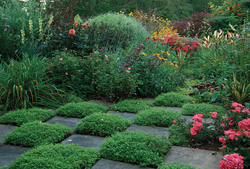
2. Hot-color garden 3. Checkerboard patio 4. Blue-and-white garden 5. Front-yard pond 6. Pastel garden |
So how do you establish order? It’s actually easier than it might sound. All you need to do is keep proportions balanced, stick to a color scheme, and avoid making any sudden changes. By applying color within this framework, you can create a gorgeous space, without having to stress over long lists of designer dos and don’ts.
A simple ratio lets each color look its best
In my garden, I have developed a series of rooms, each with its own color scheme. While the style of the plantings and my approach to color are relatively consistent, the changing palettes make the rooms feel quite different.
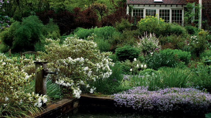
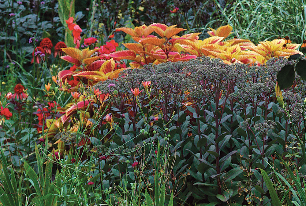
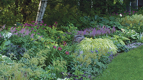
During the early stages of planning, I typically select no more than three main colors (excluding green) and a fourth highlight color for creating contrast. Giving each main color equal weight keeps proportions in check, while the accent color spices up the palette. In my pastel front-yard garden, for instance, I use roughly equal amounts of pink, white, and blue (photo, above). As a highlight, I add splashes of soft yellow (silver foliage would offer a similar effect). My back patio, in contrast, has a bold color scheme, with yellows, oranges, and reds, all given relatively equal standing, while patches of dark purple provide contrast and cool down the sweeps of bright hues.
To avoid a busy look and to keep the eye moving, plant large groups of each color and repeat them throughout your beds. You might add a mass of pink, for instance, followed by a large grouping of white, trailed by a mass of blue, then touches of yellow as highlights. Once established, repeat this pattern—or a subtle variation of it—throughout the garden. If the beds have a great deal of depth, stagger the pattern from the front to the back.
Using restraint prevents a cluttered look
Sticking to a color scheme often means bypassing beloved plants for the sake of good design. If your goal is to create a pastel garden, don’t introduce reds or oranges in a moment of weakness. No matter how much you’re drawn to that pot of scarlet poppies or bright yellow zinnias, don’t give in to these whims. The rewards of restraint far outweigh the sacrifices. We all know that an abundance of flowers does not guarantee a beautiful garden. Too much variety tends to overwhelm viewers. Limiting your color palette makes it easier to strike a pleasing balance. And for the novice who finds the infinite varieties of plants daunting or the enthusiast who shops compulsively, fewer options at the nursery might actually feel like a blessing.
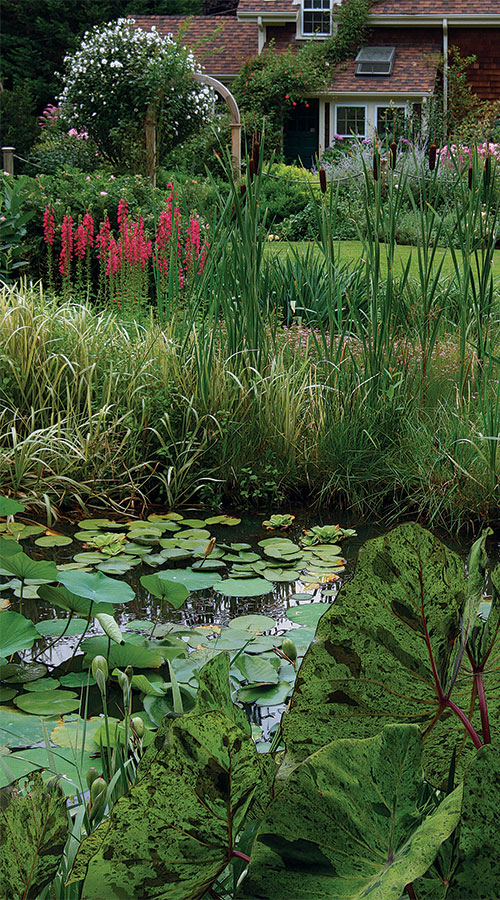
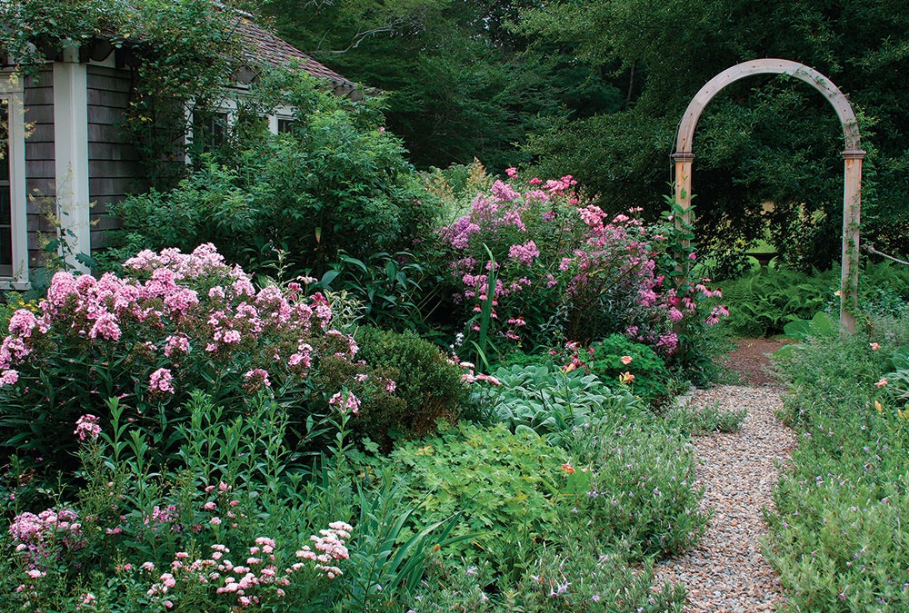
There are times, of course, when self-control is unrealistic. A few years back, I became enamored of pink water lilies. At the time, my only water feature was in the blue-and-white garden, and adding the color pink was out of the question. So I rethought my space and built another pond on the other side of the house facing my front garden. Filled with pink, white, and yellow water lilies, this pond blends with my pastel entry garden because they share the same color scheme (photo, right). This approach works just as well on a smaller scale, when simply cutting one or two new beds will do the trick.
Smooth transitions keep colors from clashing
If your garden has more than one color scheme, don’t just butt them together; add transitional spaces between them. These neutral areas soften the contrast between different sections of a landscape and give the viewer’s eye a chance to rest. There are essentially two approaches to designing a transitional space. You can either rely on a neutral color palette of greens, tans, and grays or incorporate colors and plants from the two areas you’re linking together. I’ve done both.
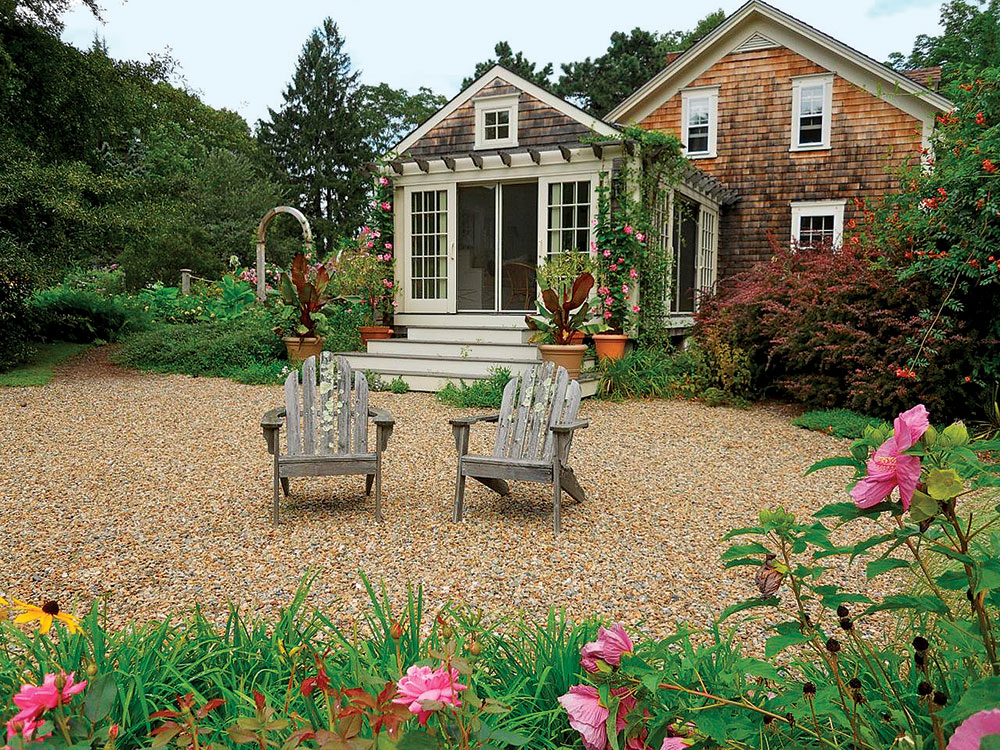
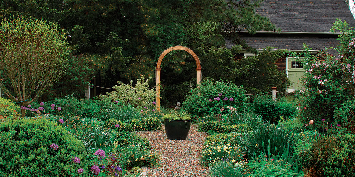
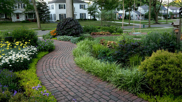
The tan gravel patio that stretches along my side yard creates some necessary breathing room between the pastel front garden and the hot-color back garden (photo, above). The pale yellows, silvers, and hot pinks planted around the patio intentionally flatter both gardens equally. Meanwhile, the checkerboard patio that connects the hot-color garden to the blue-and-white garden serves the same purpose as the gravel patio (photo, below). Its geometric patches of golden thyme offer a neutral color palette that gently leads the viewer from one area to another. These visually quiet spaces are as important as the more colorful ones. Use them to pace the viewer’s experience and enhance the beauty of your garden.
Let the color palette set the mood
Nothing has more immediate impact on a garden’s vibe than color. Decide how you want a space to make you feel, then choose the palette accordingly.
Craving peace and quiet? Go blue and white
This classic duo blends seamlessly with nature, complementing water, woodlands, and open fields. Use it to create a cool retreat for hot summer days.
Seeking a warm welcome? Plant pastels
Soft tints of pink, blue, and yellow set a convivial tone that’s perfect for entryways and front yards. Plus, pastels flatter almost any facade, including brick, stone, cedar shingles, and painted clapboard.
Yearning to entertain? Pick hot colors
Bright hues or bold combos, like red and yellow or orange and purple, demand attention and infuse a garden with energy. Use them around spaces where you’d throw a party.
Andrew Grossman is a landscape designer in Seekonk, Massachusetts.
Photos, except where noted: Ann E. Stratton
Illustration: Elara Tanguy


Comments
Log in or create an account to post a comment.
Sign up Log in