Some folks shy away from hot colors, associating them with gaudy, boisterous displays. I don’t totally disagree. I’ve seen some misguided combinations that could send even a color-blind retriever running for his Ray-Bans. But when done right, hot colors have a lot to offer.
Because they reflect more light than they absorb, hot colors make plants look bigger and closer than they actually are. When I design a bed that has to dazzle from a distance, I reach for reds, oranges, or yellows. These hues add energy, good cheer, and even sensuality. They seem to holler, “Look over here!” They’re perfect for making a fountain or gateway stand out from its background or injecting new life into an old garden dominated by shade and dark green leaves.
The secret to using hot colors relies on a basic understanding of color theory. Painters use these principles to bring beauty and emotion to a flat canvas. You can make your summer garden come alive by applying these same concepts in your own backyard.
How bold can you go?
When it comes to matching colors, the color wheel is just as handy for gardeners as it is for painters. As you can see in these examples, warm color schemes aren’t an all-or-nothing proposition. Like salsa on a taco, you can choose a boldness that suits your individual taste.
Bold
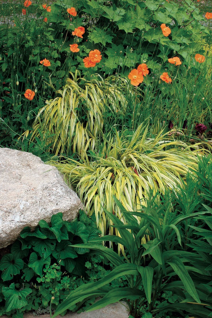
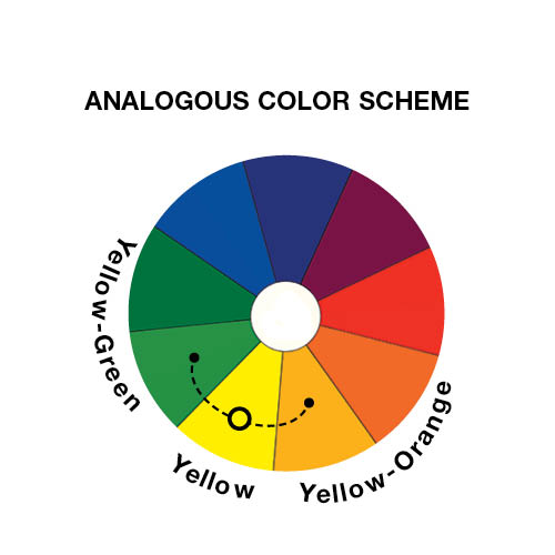
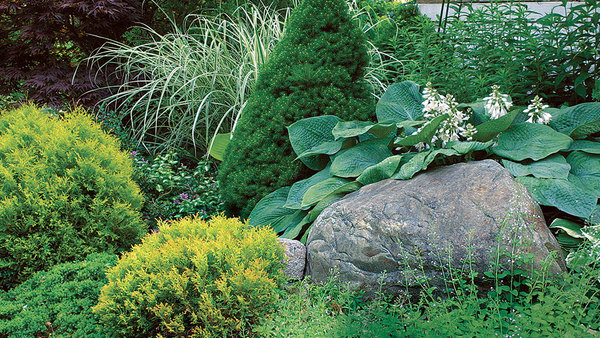
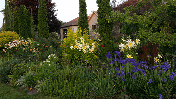
When I want a shady bed to attract the eye but not overwhelm the scene, I use an analogous color scheme, consisting of three colors bordering each other on the color wheel. A key color—yellow, in this example—plays the leading role, with support from its neighbors (yellow-orange and citrus green). Adding pale yellow foliage and peachy blooms to this shady spot is like flipping on a spotlight.
Bolder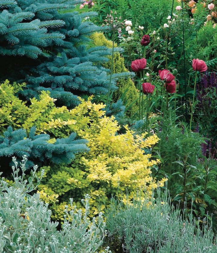

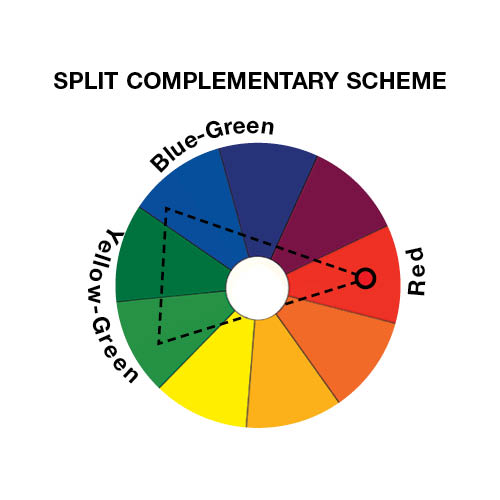
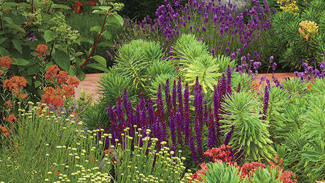
For gardens needing more kick, try a split complementary scheme. Red provides the heat in this design, while cool shades of blue-green and chartreuse keep it in check. Mixing in light neutrals, such as white, silver, or gray, heightens the contrast even more. Remember that warm colors will appear bigger and closer than cool ones. If you want the two to look balanced, plant more cool-colored plants than hot ones. This approach applies to both established and freshly dug beds. If you already have a border filled with yellow-green and blue-green foliage, for instance, gather your courage and toss in several dollops of red.
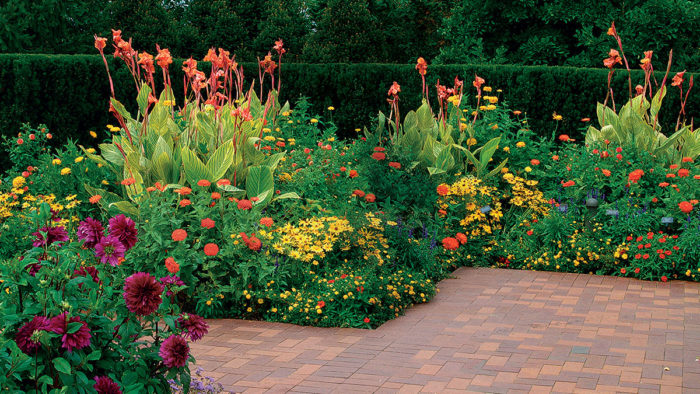
Boldest

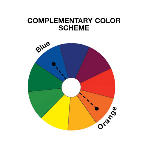
The most intense contrast comes from polar opposites, like the ready-made yellow-and-violet face of a Johnny-jump-up viola. Other hot-and-cold combinations include orange paired with blue, and red teamed with green. High contrast means more drama, so use these complementary schemes sparingly. They’re perfect for upping the intensity of containers or other focal points. Also, notice here how the turquoise planter cools down the burnt orange foliage. Don’t limit your palette to just flowers. Luminous chartreuse foliage, smoldering red gazing globes, or a dazzling orange hummingbird feeder can play a lively role in a garden’s color scheme.


Comments
the colorwheels are not with the right descriptions!!! you might want to fix that! confuses the heck out of us colorblindgardeners! lol
So sorry! That was a reformatting error. We have altered. Thank you for pointing it out!
Log in or create an account to post a comment.
Sign up Log in